Adero
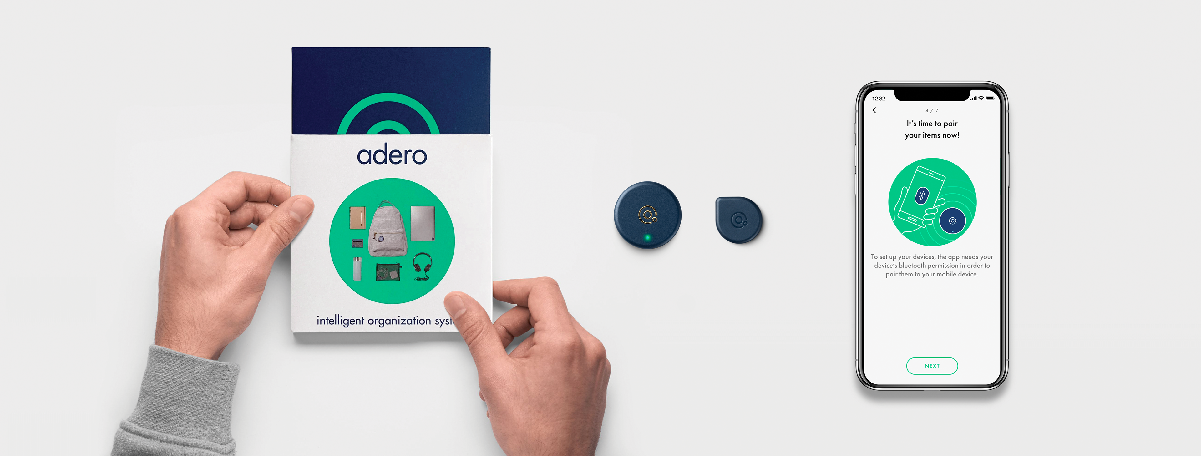
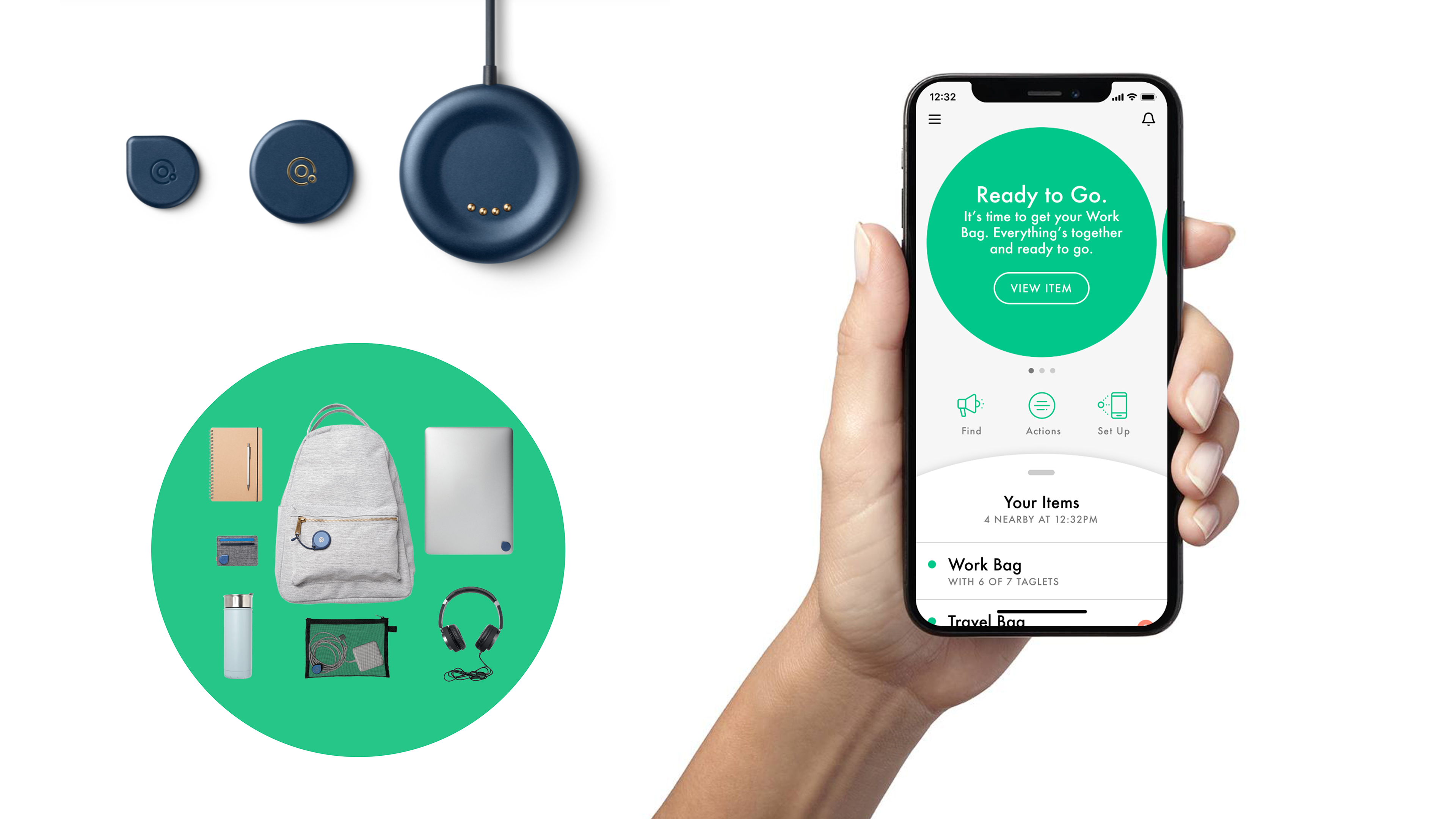
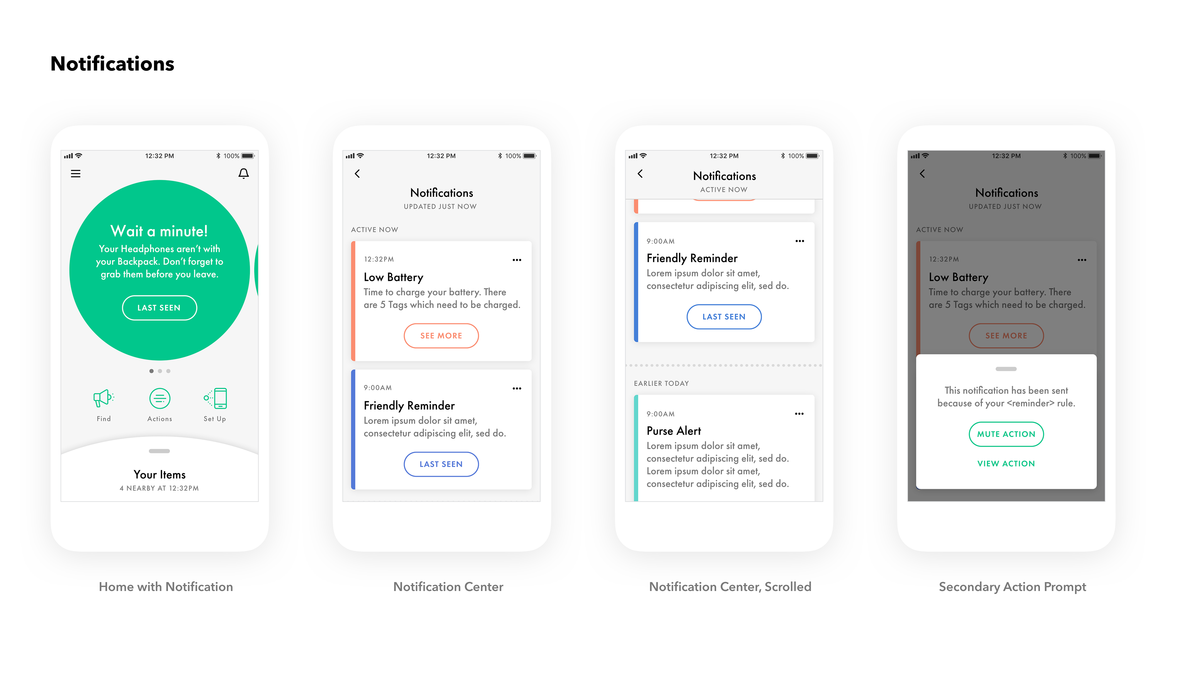
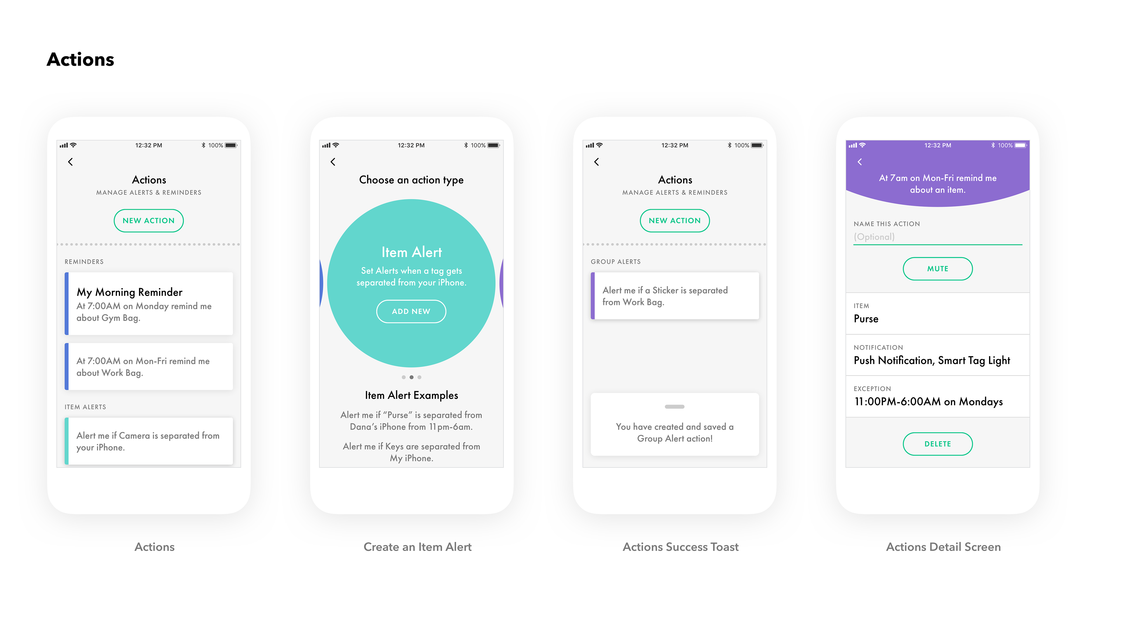
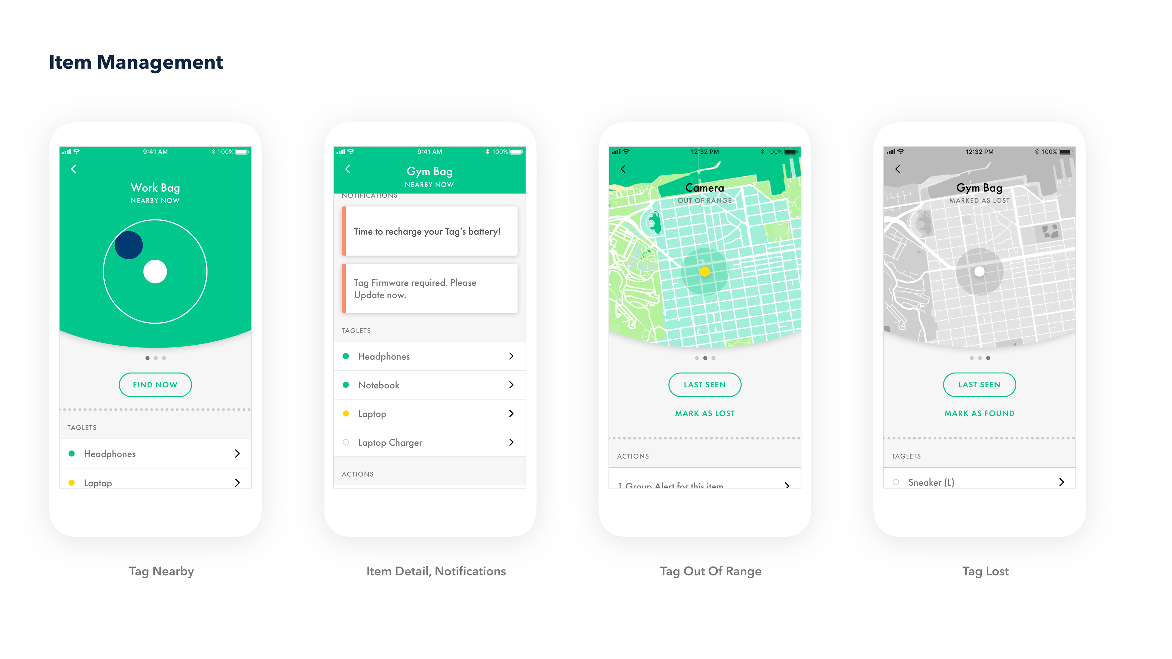
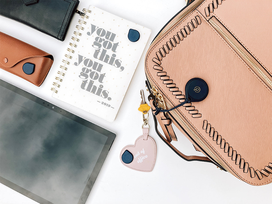
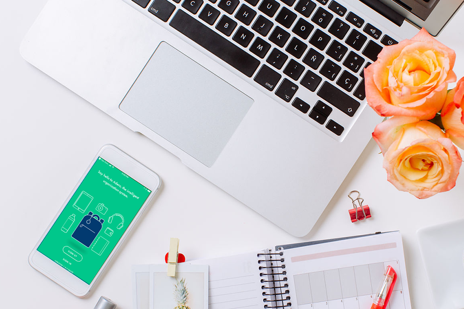
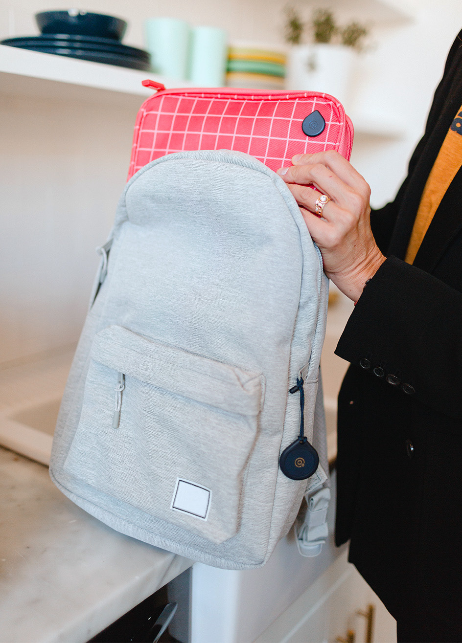
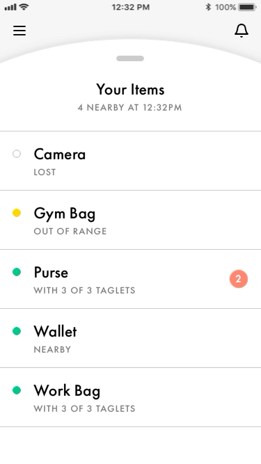
Adero is a two-part system comprising smart tags and “taglets.” The former adhere to bags, carry-on’s, backpacks, gym bags, and containers, while the latter stick to items stowed inside of those packs, such as wipes, headphones, laptops, and passports. The smart tags communicate with taglets and alert users through Adero’s smartphone app via a notification when they accidentally leave something important behind. The goal was to re-position the companies 2nd generation products and digital services (specifically mobile) with an emphasis on intelligent organization.
Work created while employed at MATTER
My Role
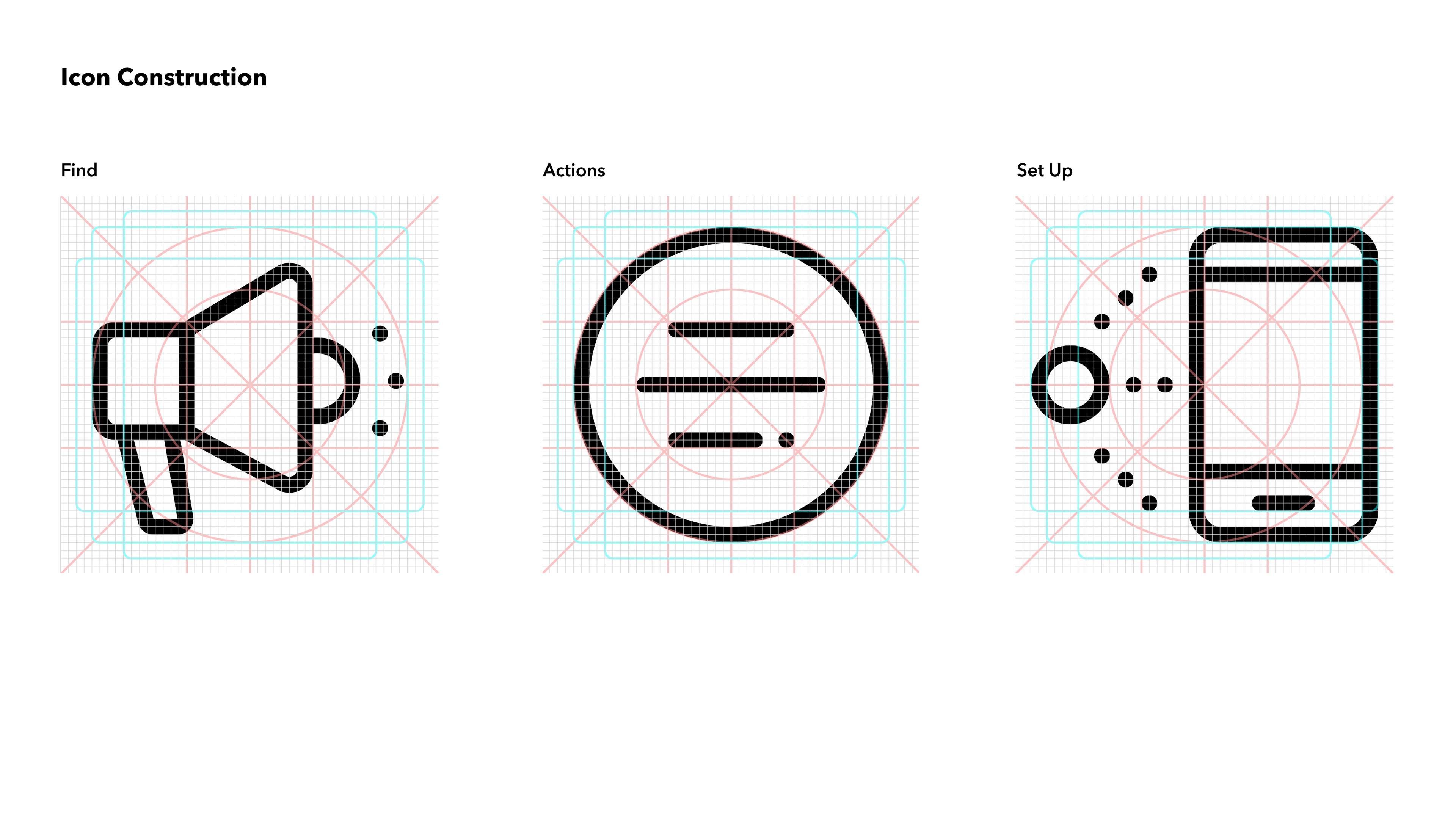
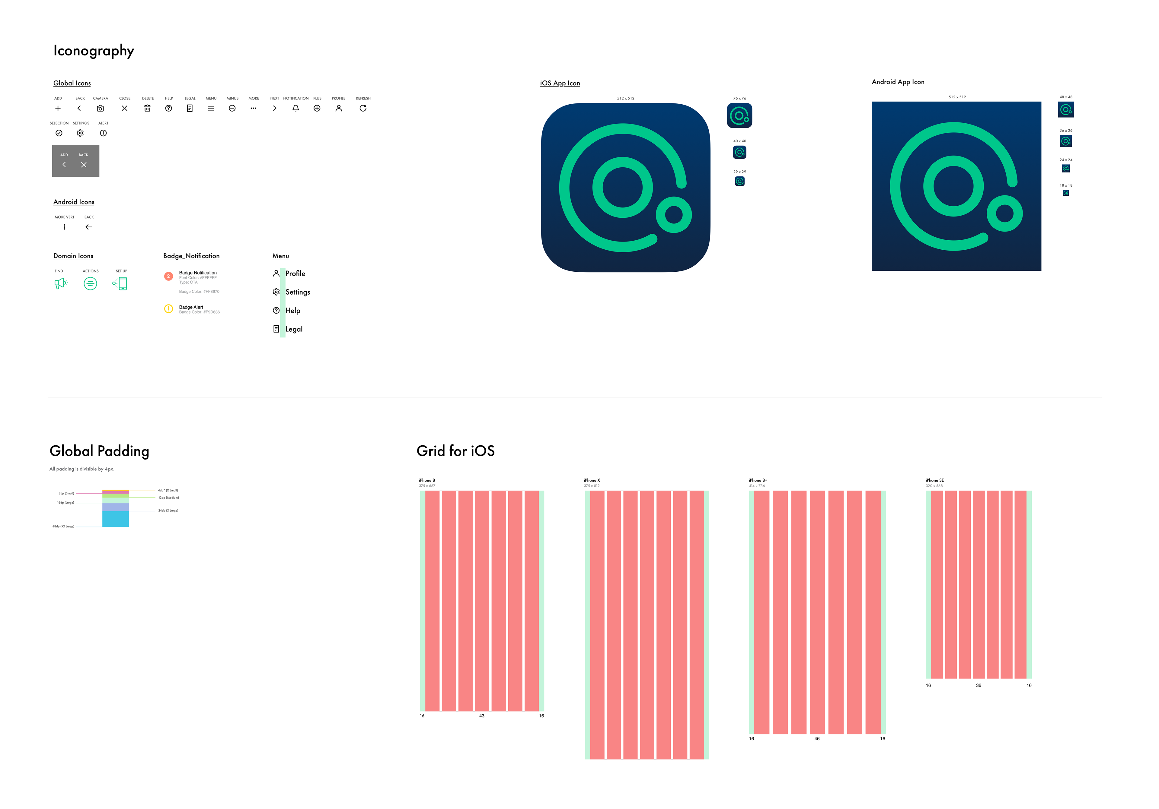
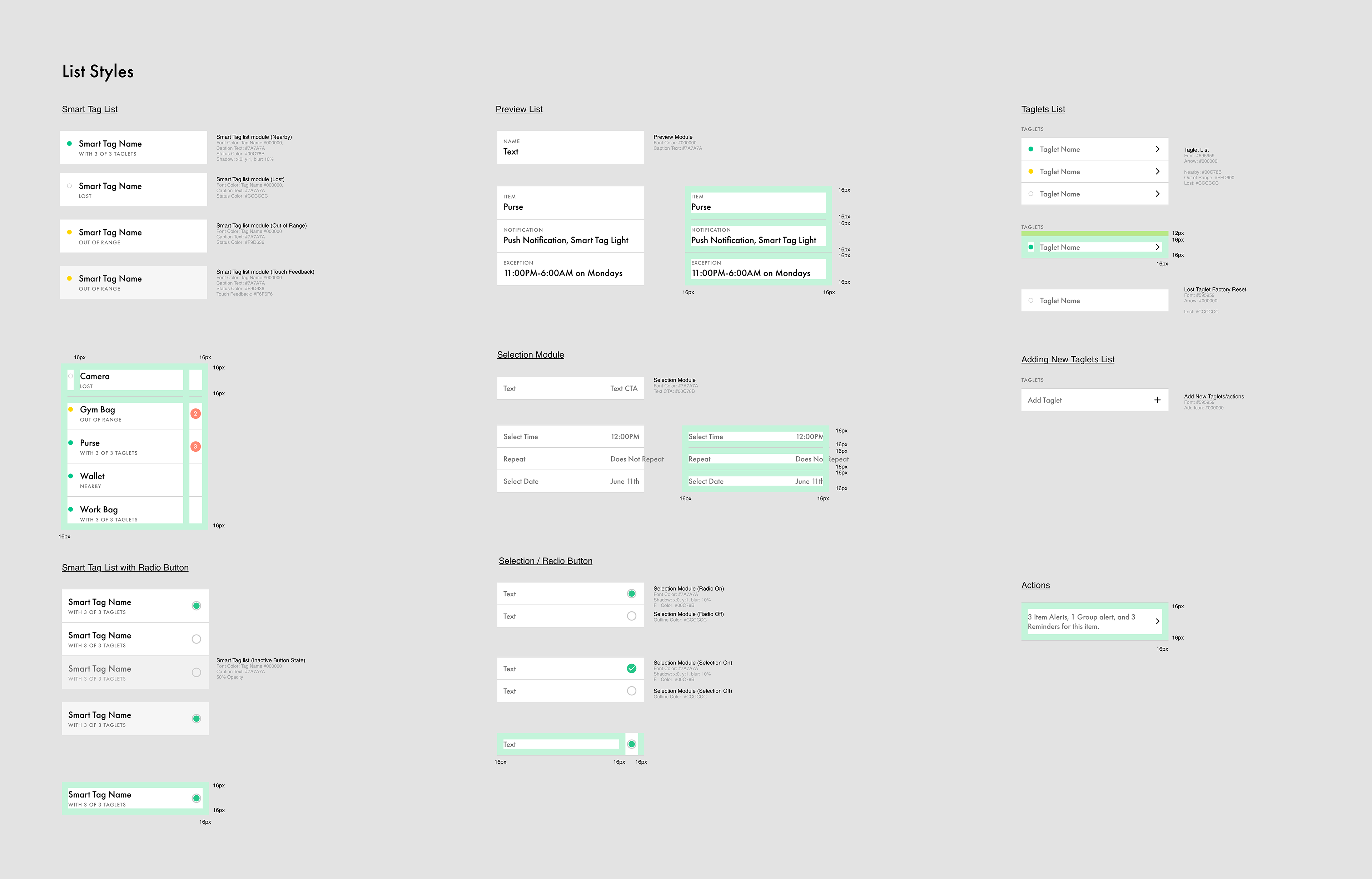
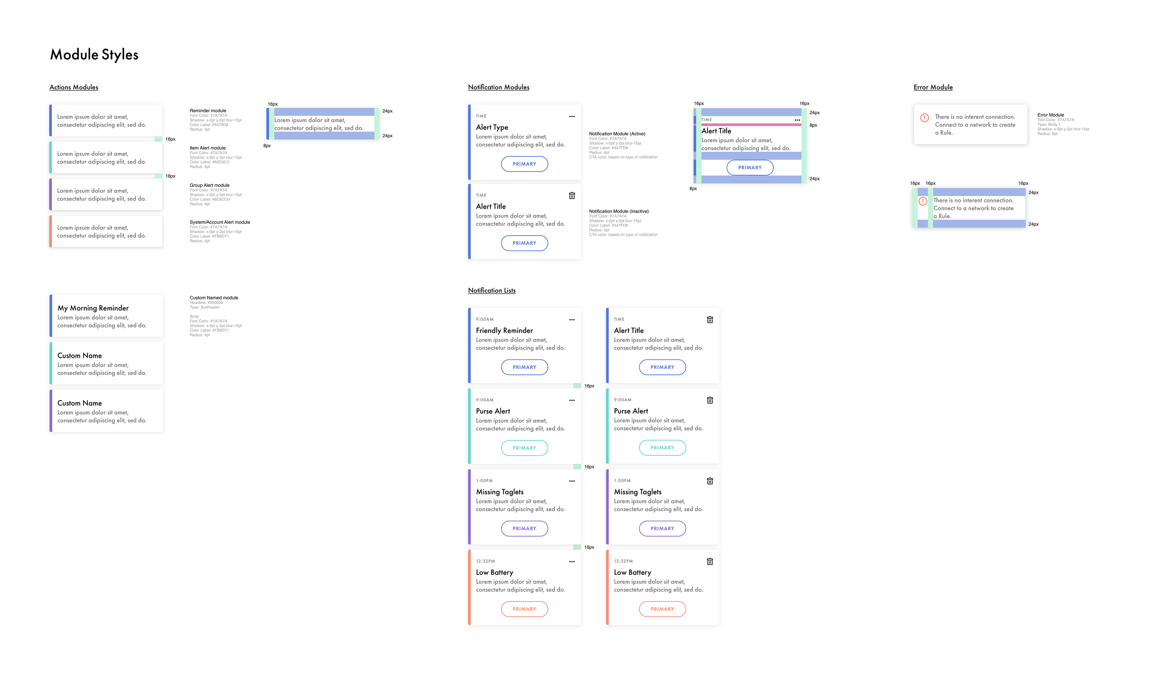
I was the lead visual designer on the project. Our team and I worked closely with the Adero product, business strategy and marketing teams. I managed two visual designers once the brand was established. Initially I designed several concepts with the UX and ID teams to create hardware/software cohesion, interaction models, user flows and the overall visual tone. I helped define product features, created client presentations and collaborated with brand and marketing parters. I created all illustrations, visualizations and icons for the mobile app and provided oversight and support for motion and UX during the development and implementation of the Design Language System.

"Unusually chic design for a CE product, this hardware works with a similarly sophisticated and well-designed app."
– WIRED
Transitions & Behaviors
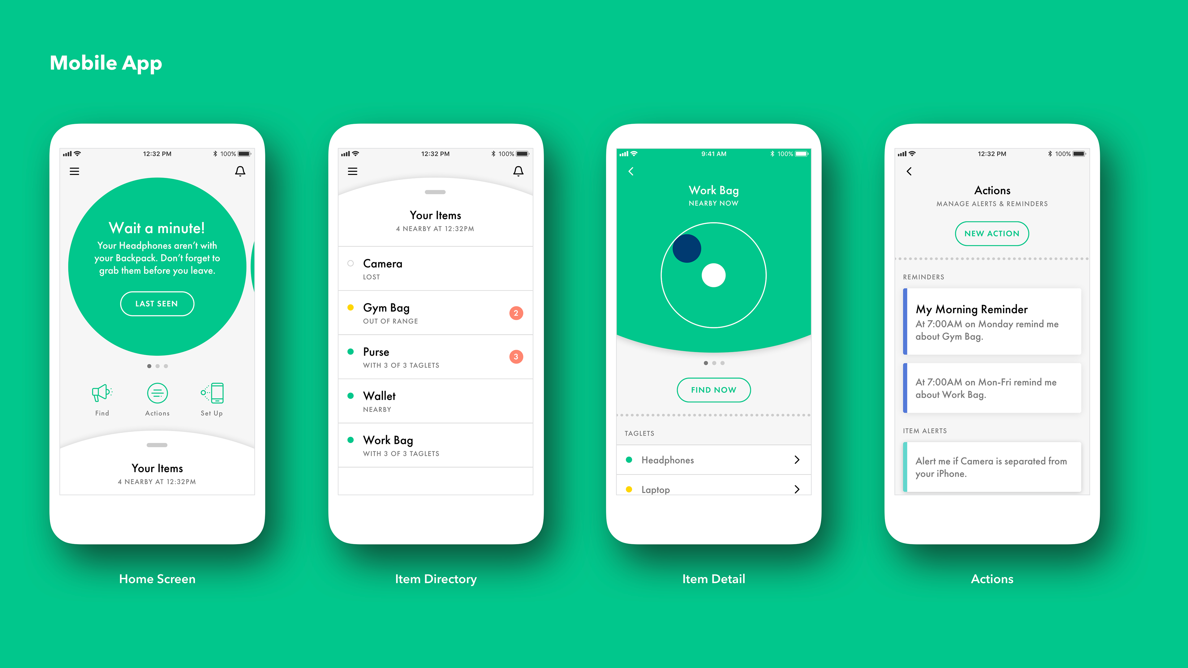
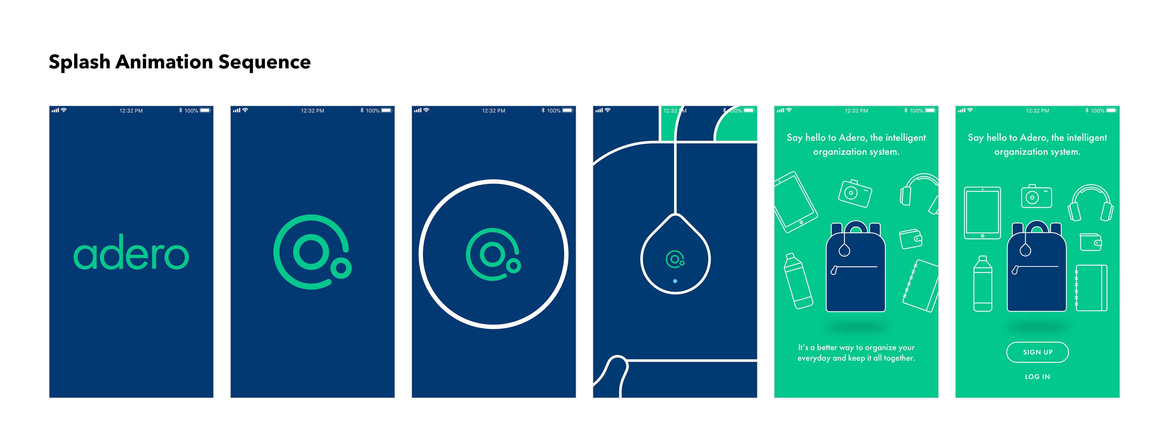
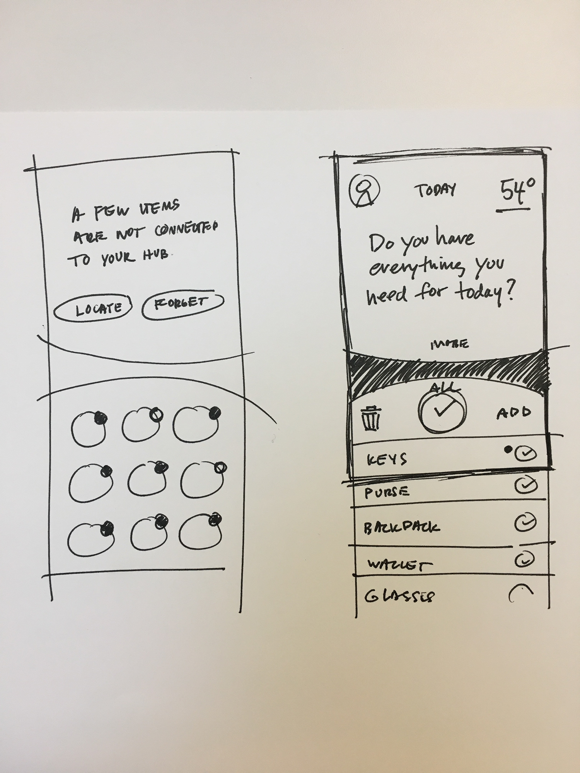
Motion played a key role in establishing a personality for the mobile app. We wanted it to feel subtle in motion yet obvious in behavior. Below are a few of the key transitions within the app experience like locating an item, swiping new notifications, accessing the item directory and tapping into an item detail. Presenting the motion prototypes to the client rather than static visual design screens really helped them understand how a user navigates the app.


open find transition

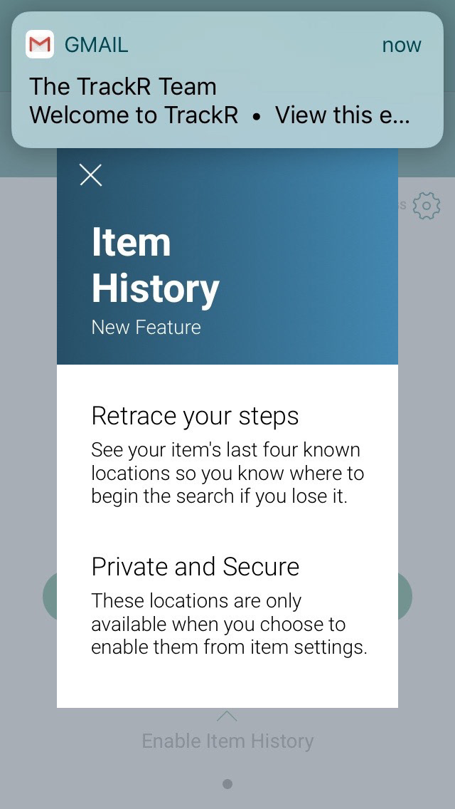
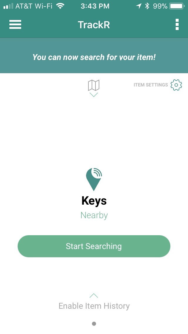
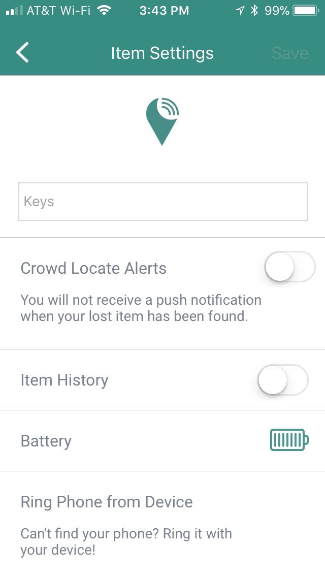
Original App Screens
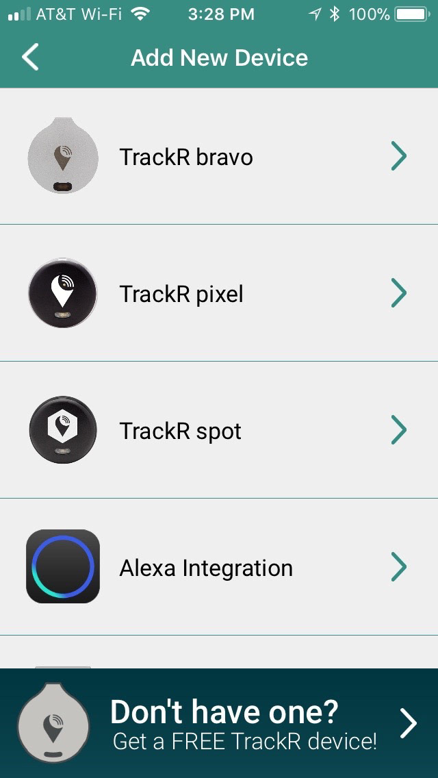
Below are a few screens from the original Trackr mobile app. Before we began the exploration phase it was understood that the client was changing the name of the company and rebranding everything.


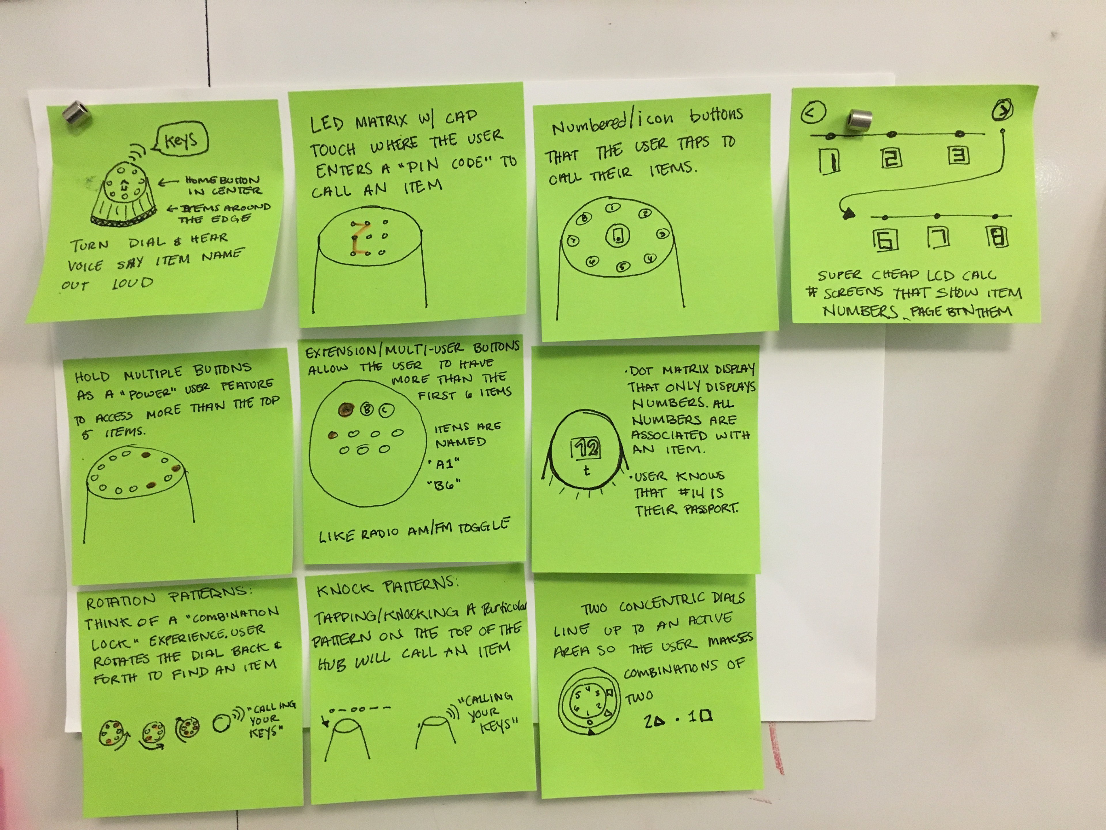
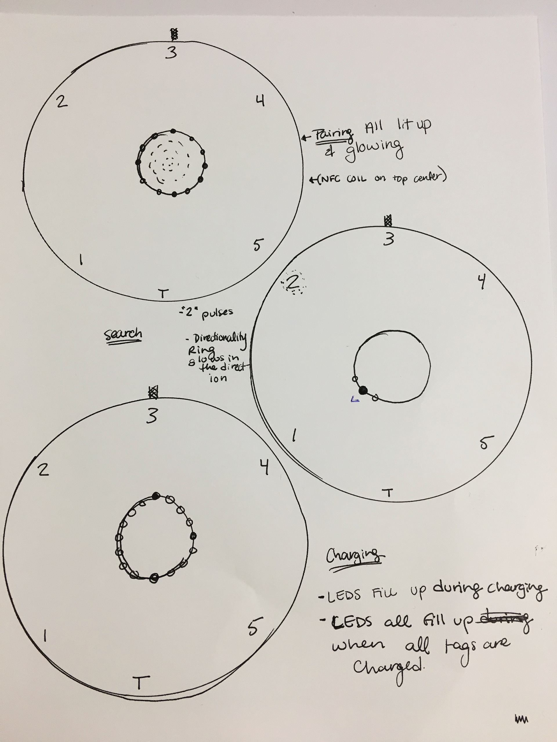
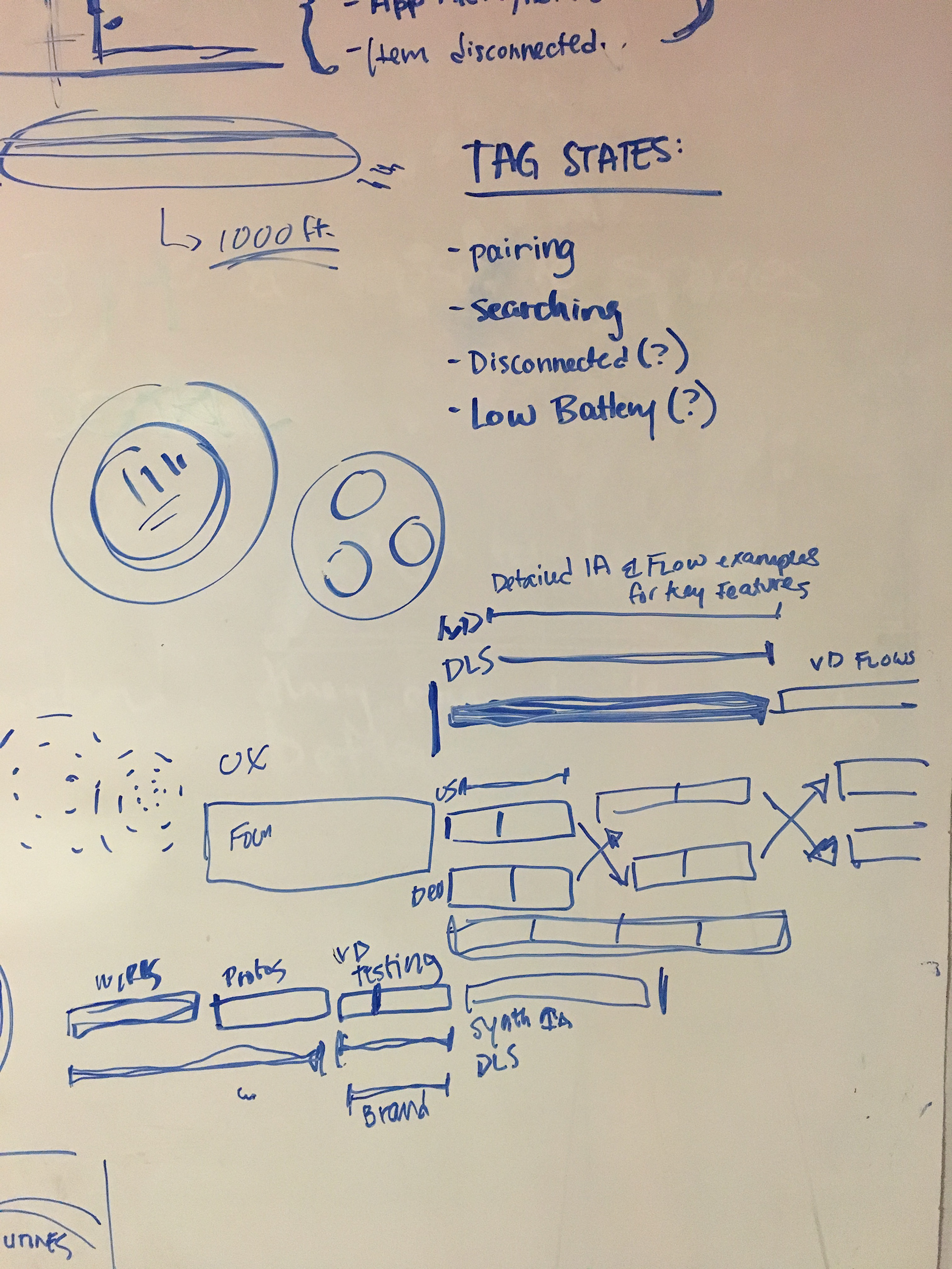
Process & Exploration
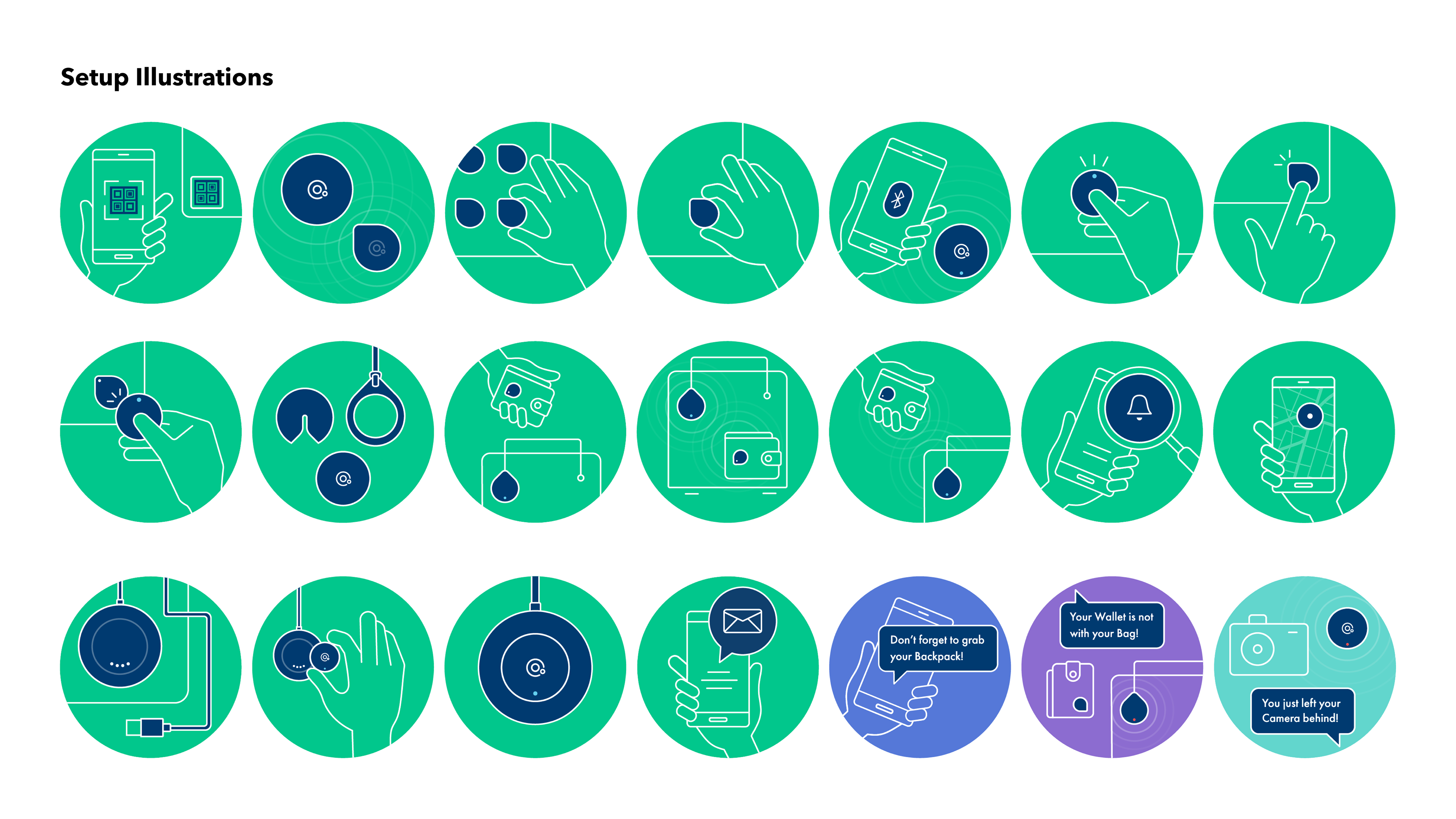
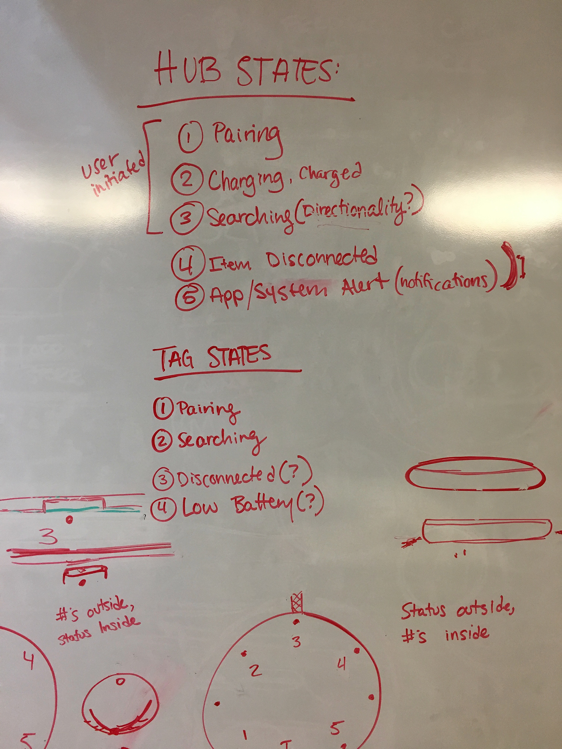
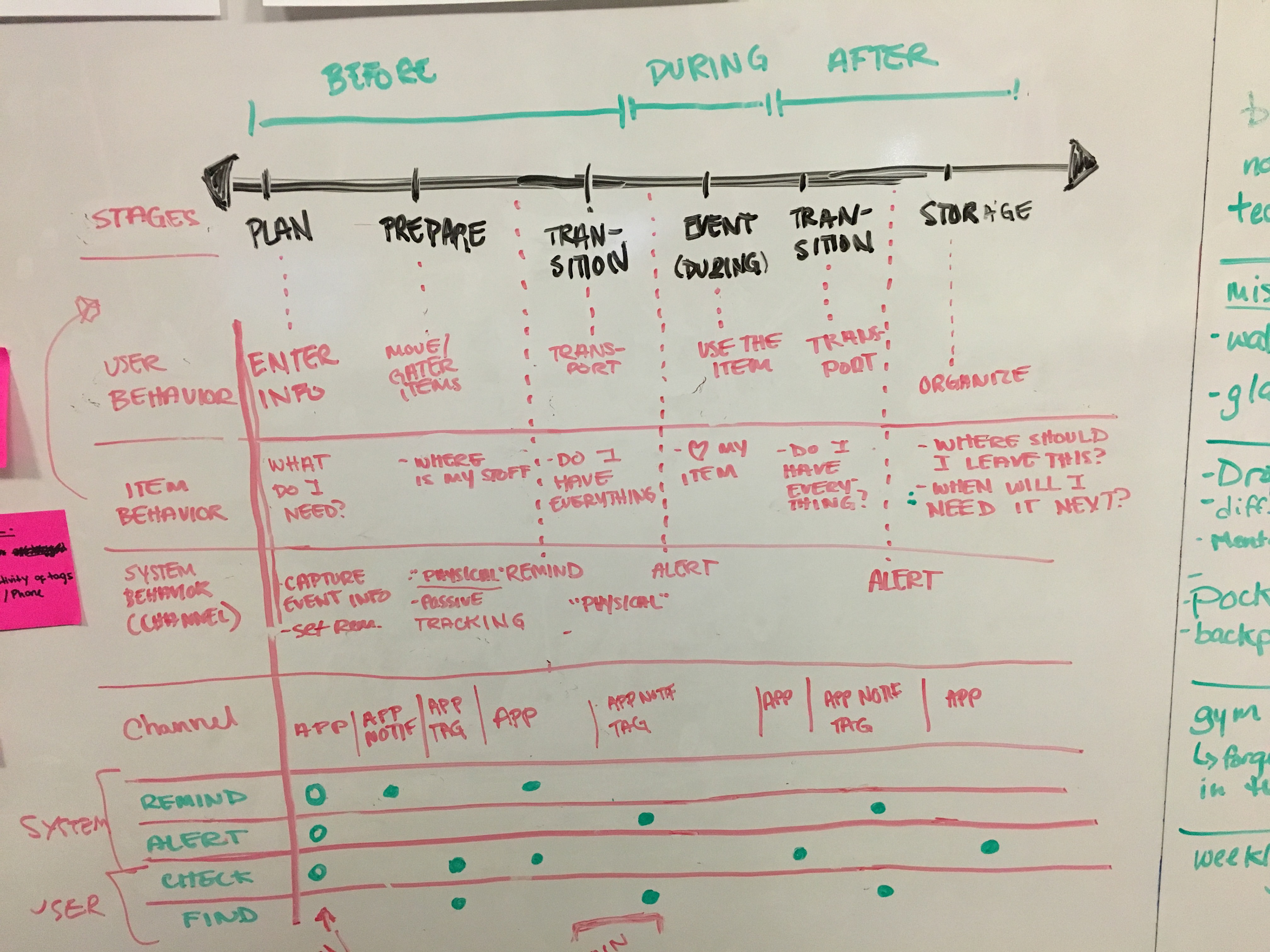
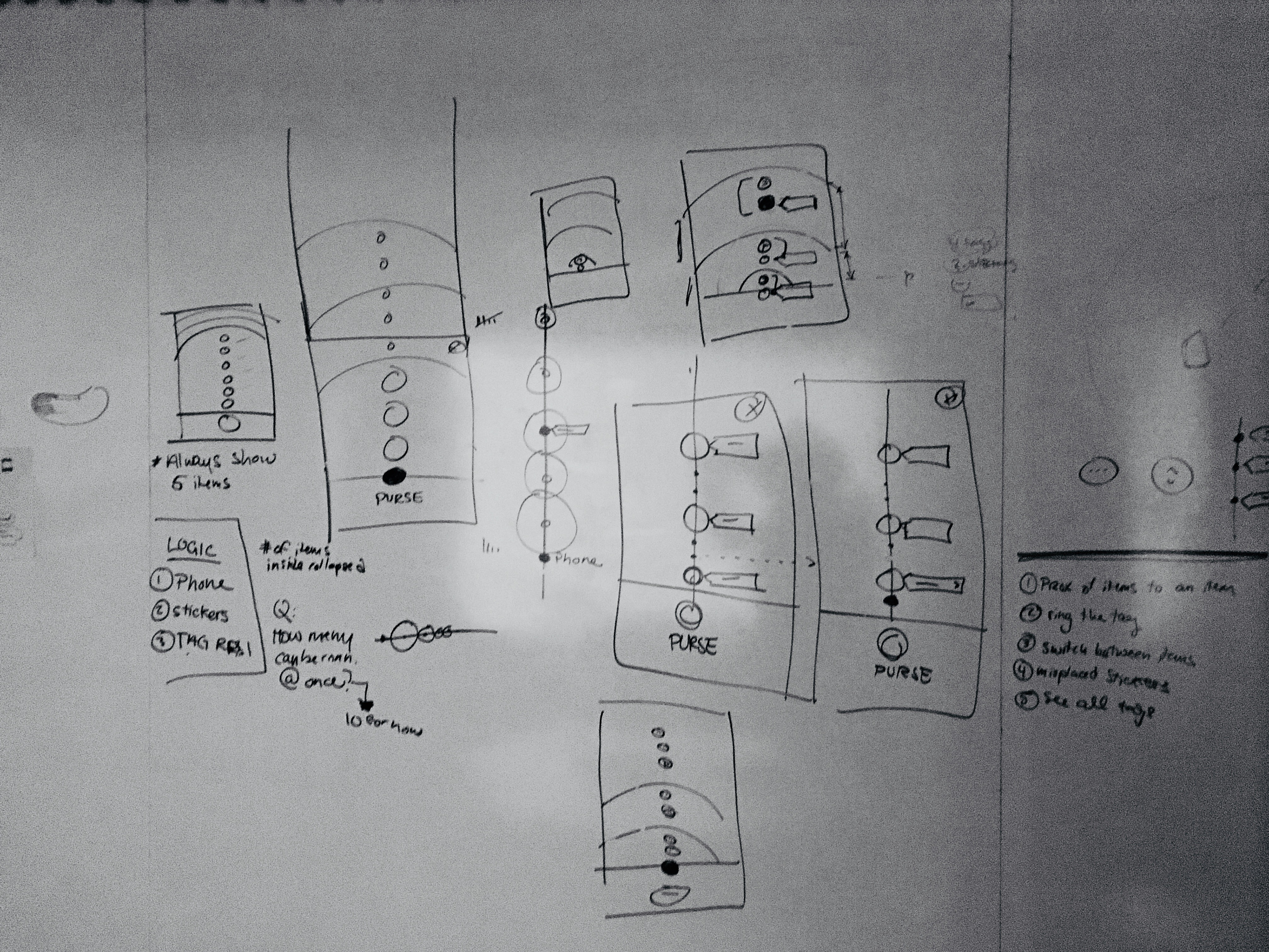
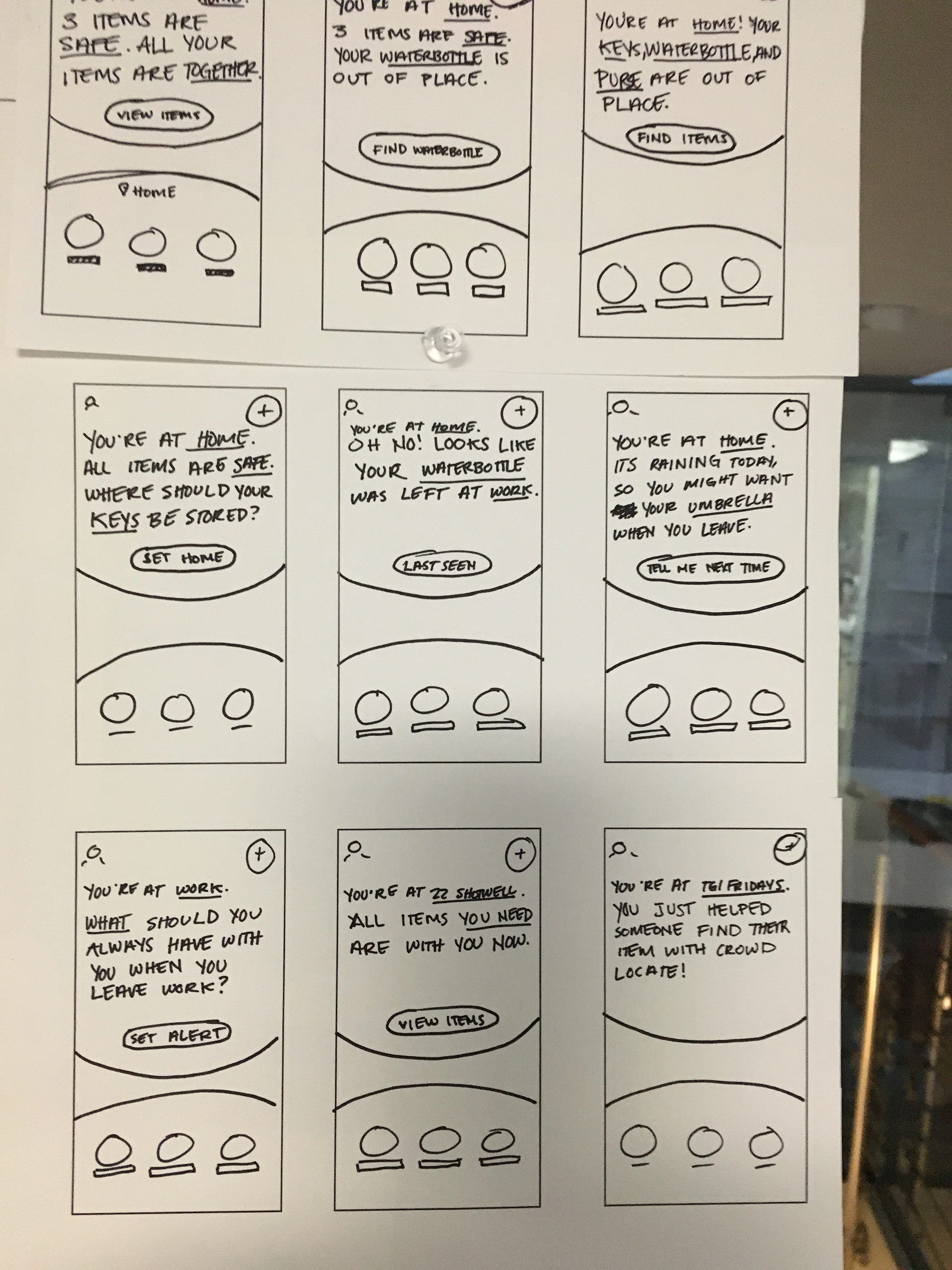
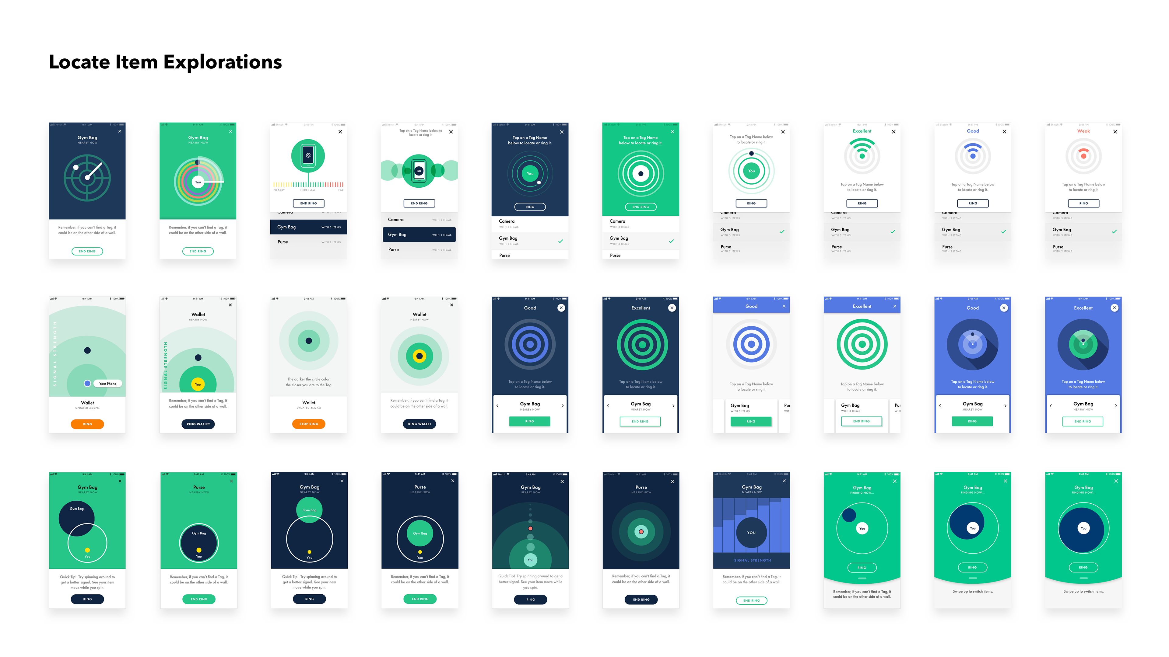
The product setup process involved significant complexity, particularly with pairing tags and firmware updates. To reduce cognitive load for users, we decided early on to implement a progressive disclosure approach for the setup experience. We began by wireframing and brainstorming internally, exploring several potential directions. This included creating paper prototypes of the packaging and conducting user and stakeholder testing to ensure our design decisions were well-founded.
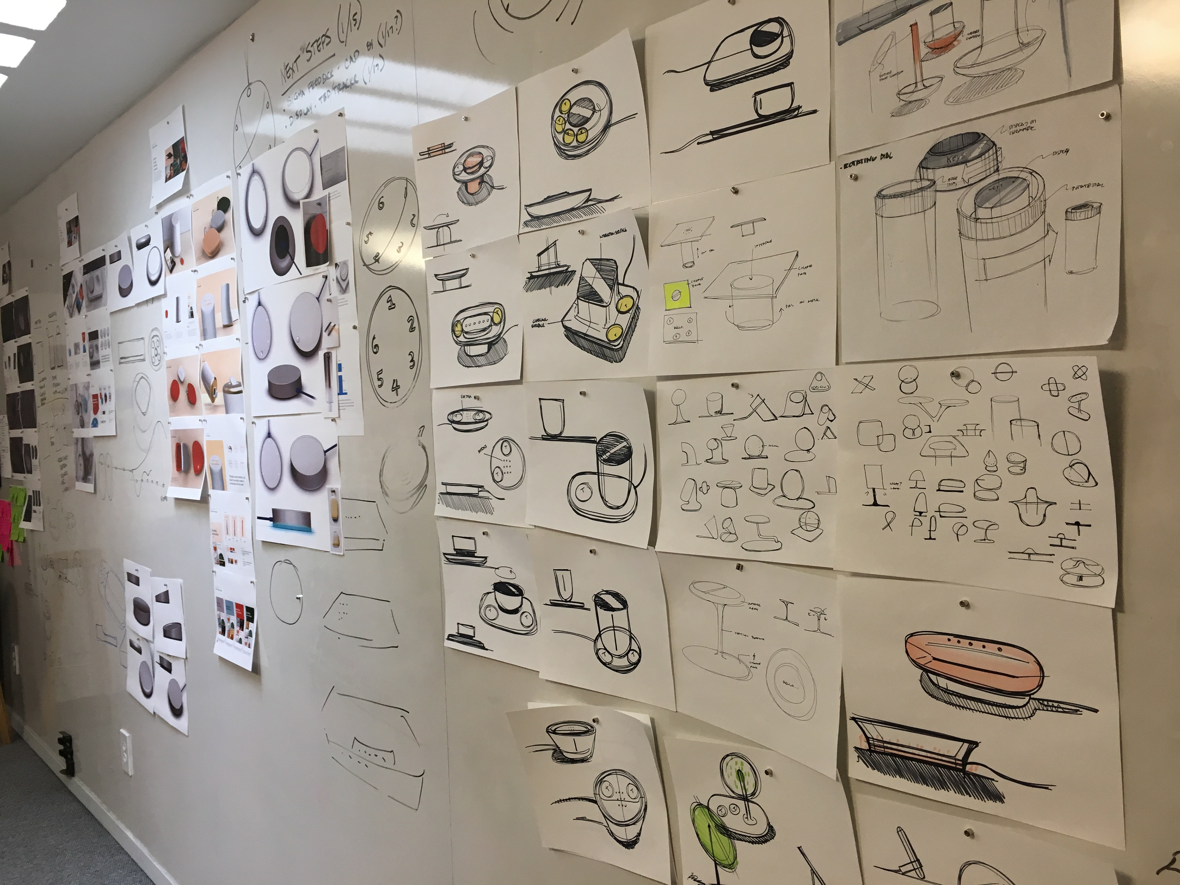
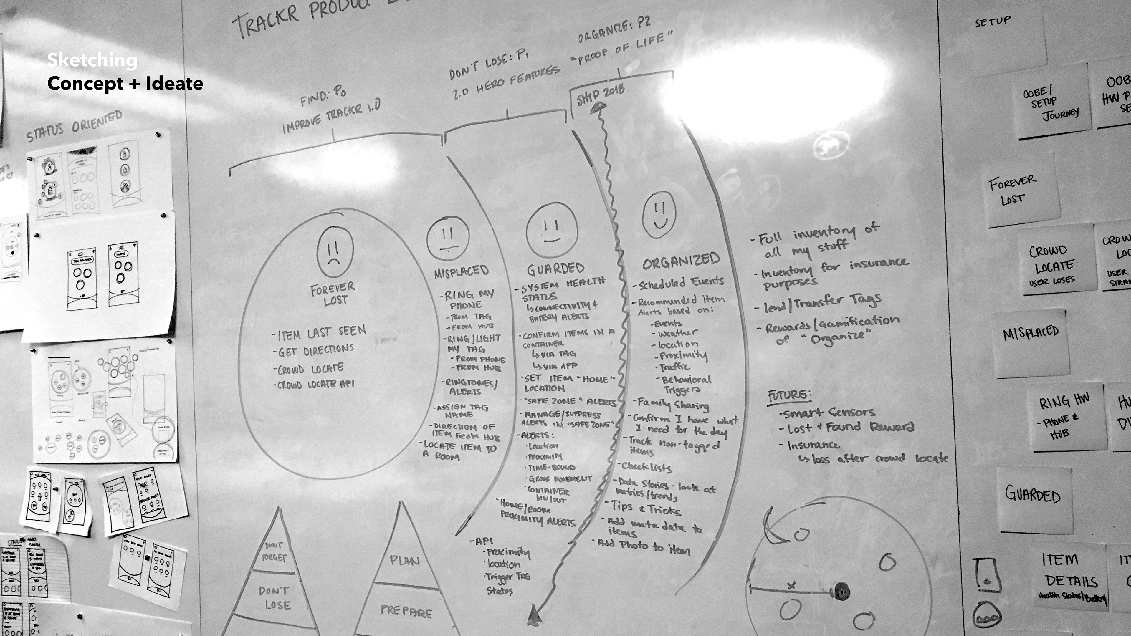


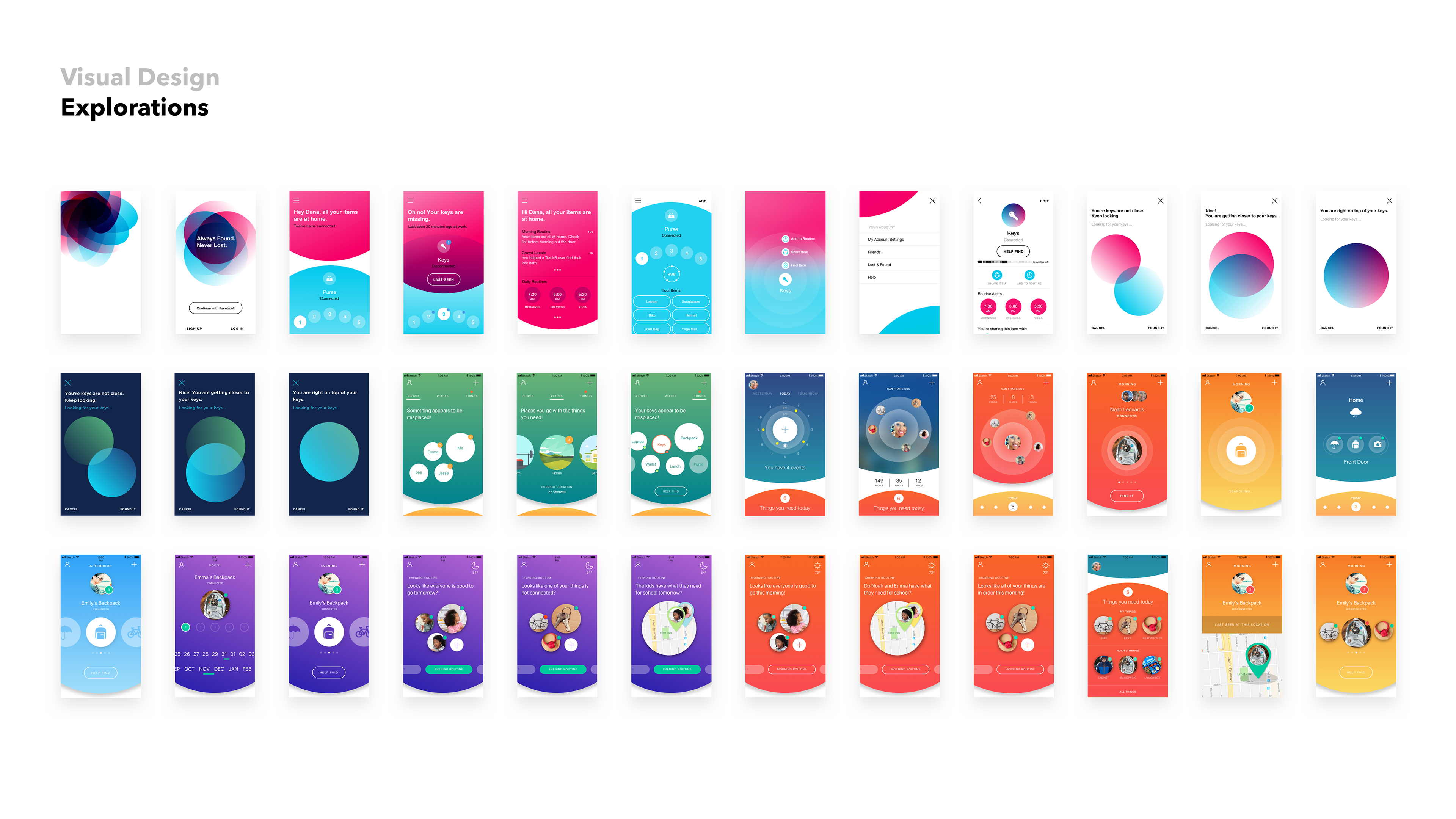
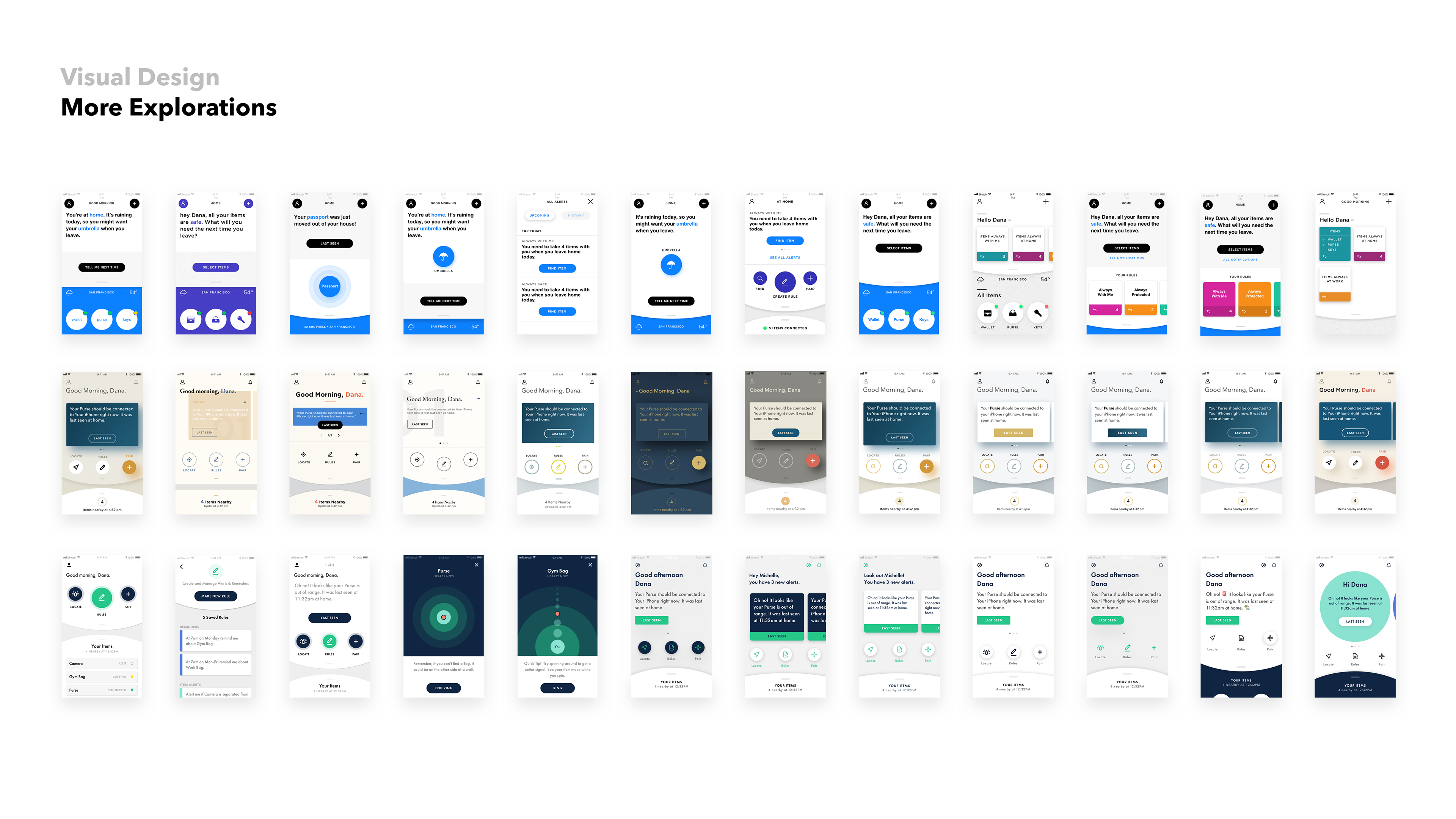
Initial Concepts
After sketching and gathering inspiration, and with no established brand identity, our team began exploring a range of design directions. The team, which included myself, a senior UX designer, two industrial designers, and a project manager, collaboratively developed several concepts. We ultimately narrowed our focus to three strong contenders that warranted further exploration. The direction we chose, "Insightful Clarity," underwent significant evolution throughout the design process, but the final outcome remained true to many of the core principles and attributes of the original concept.
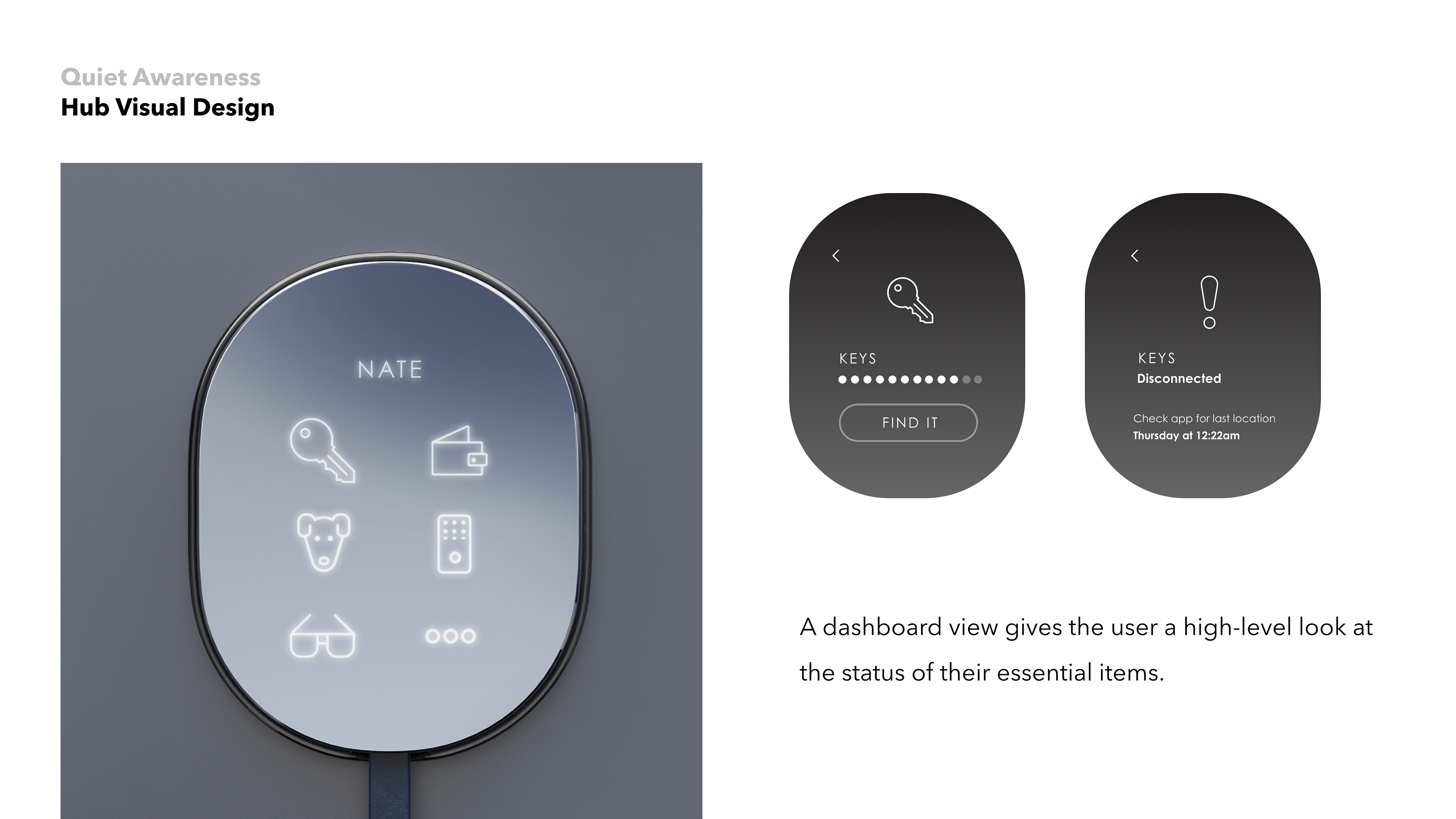
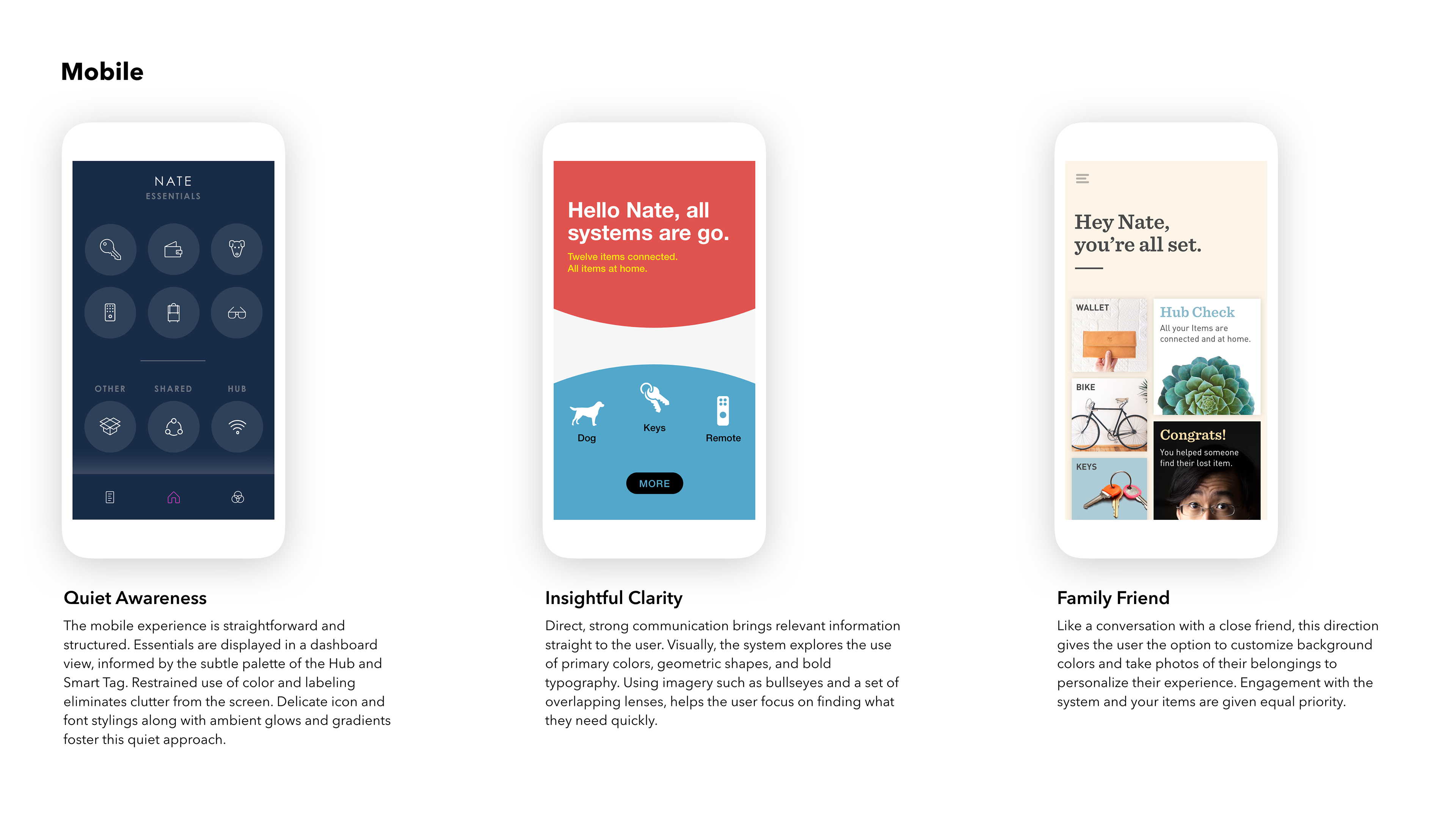
Quiet Awareness


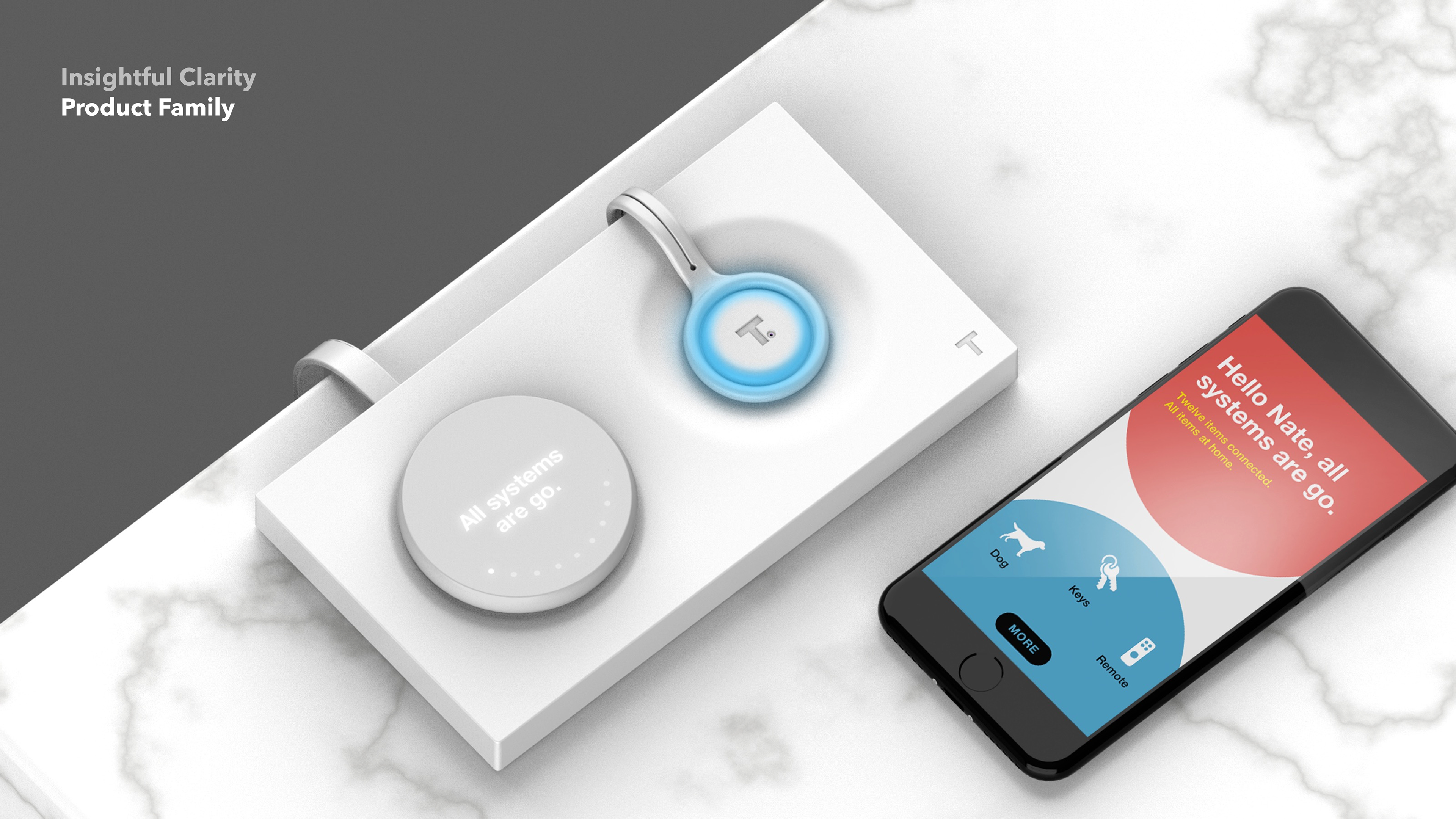
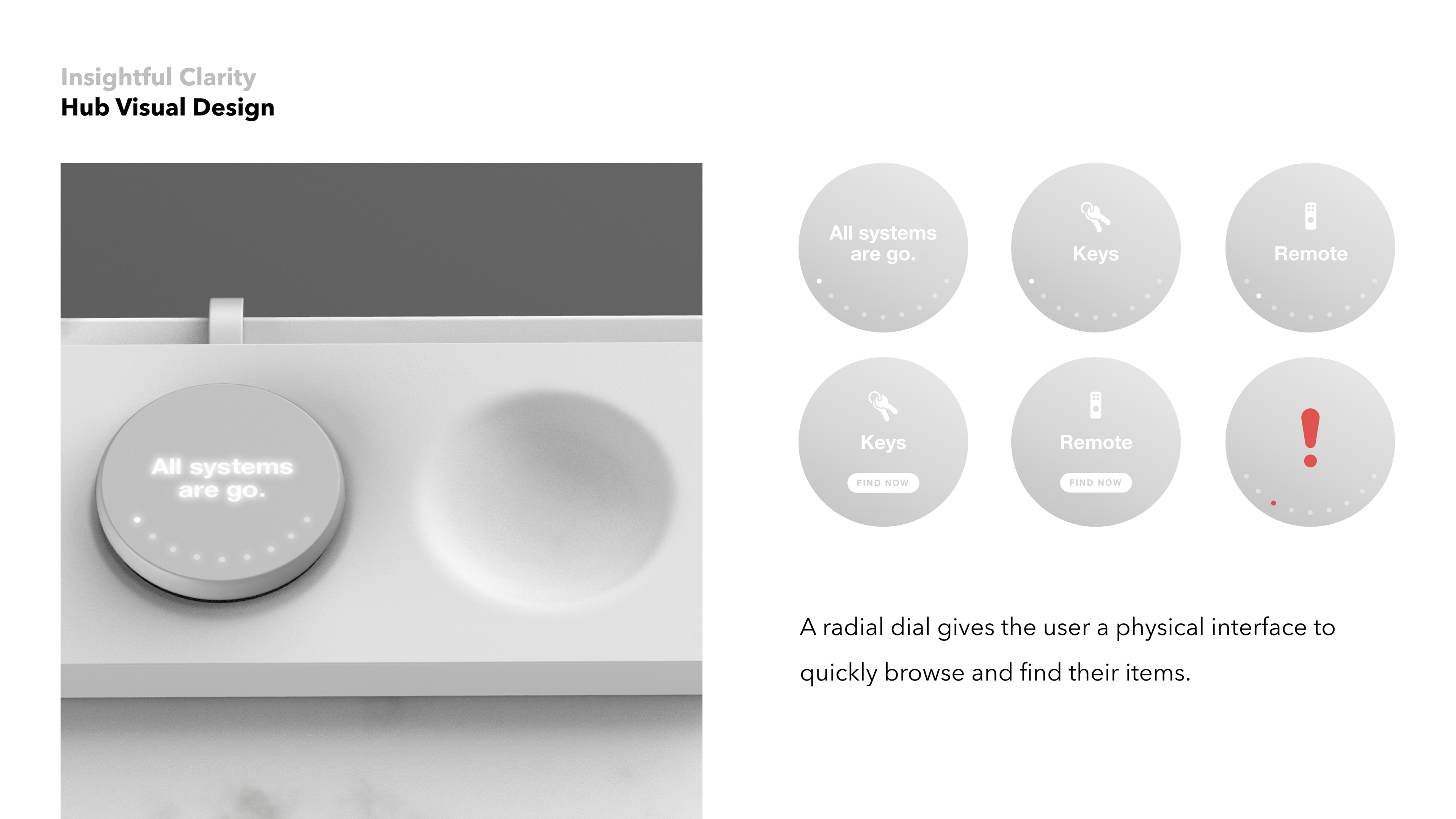
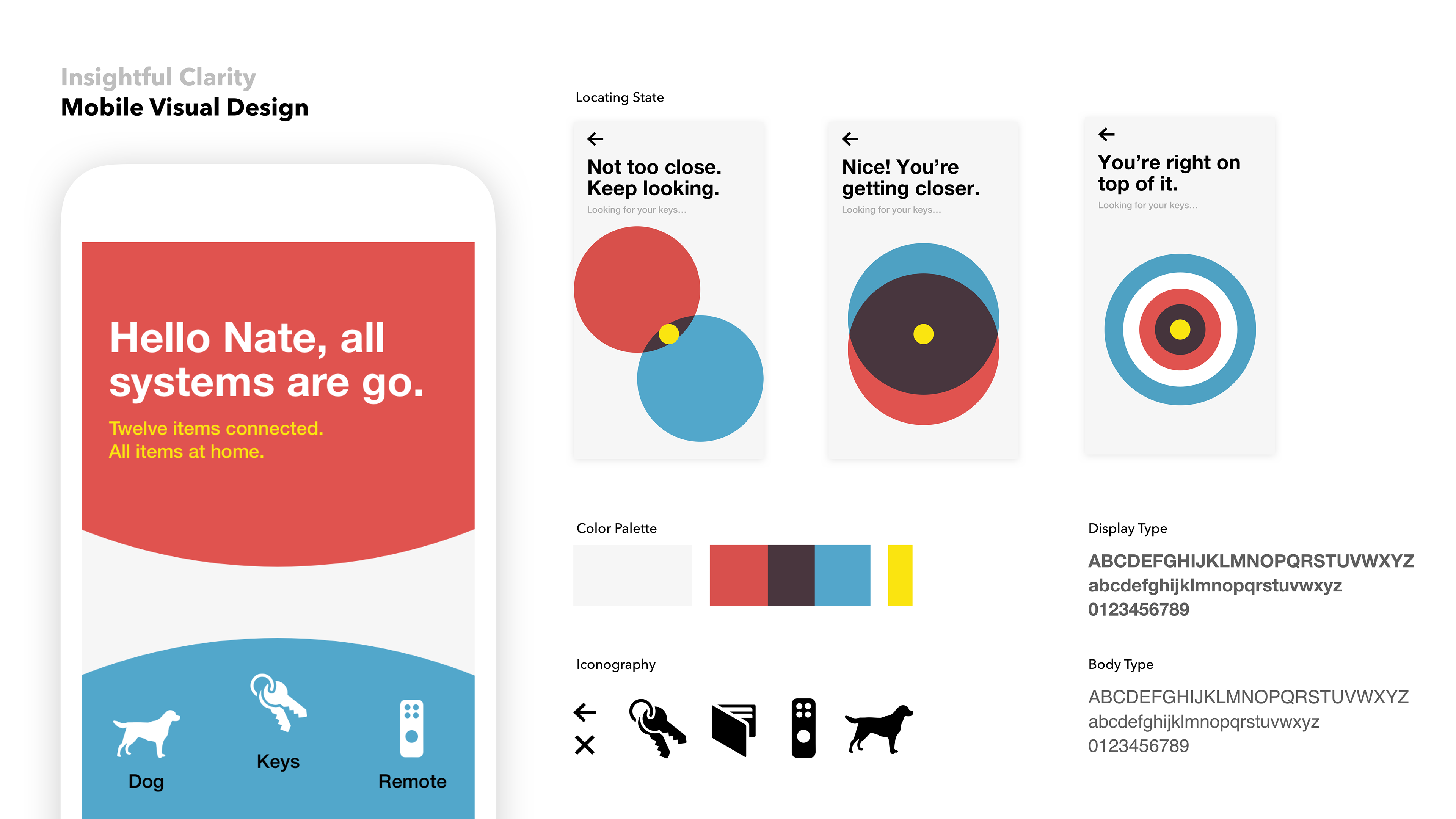
Insightful Clarity
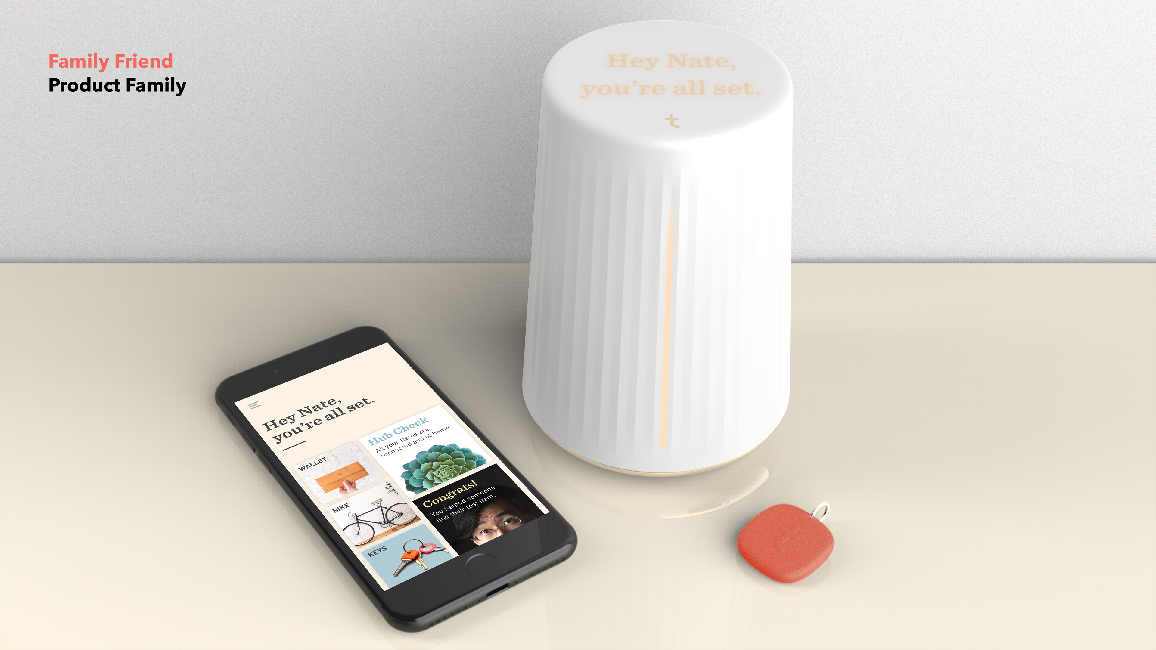
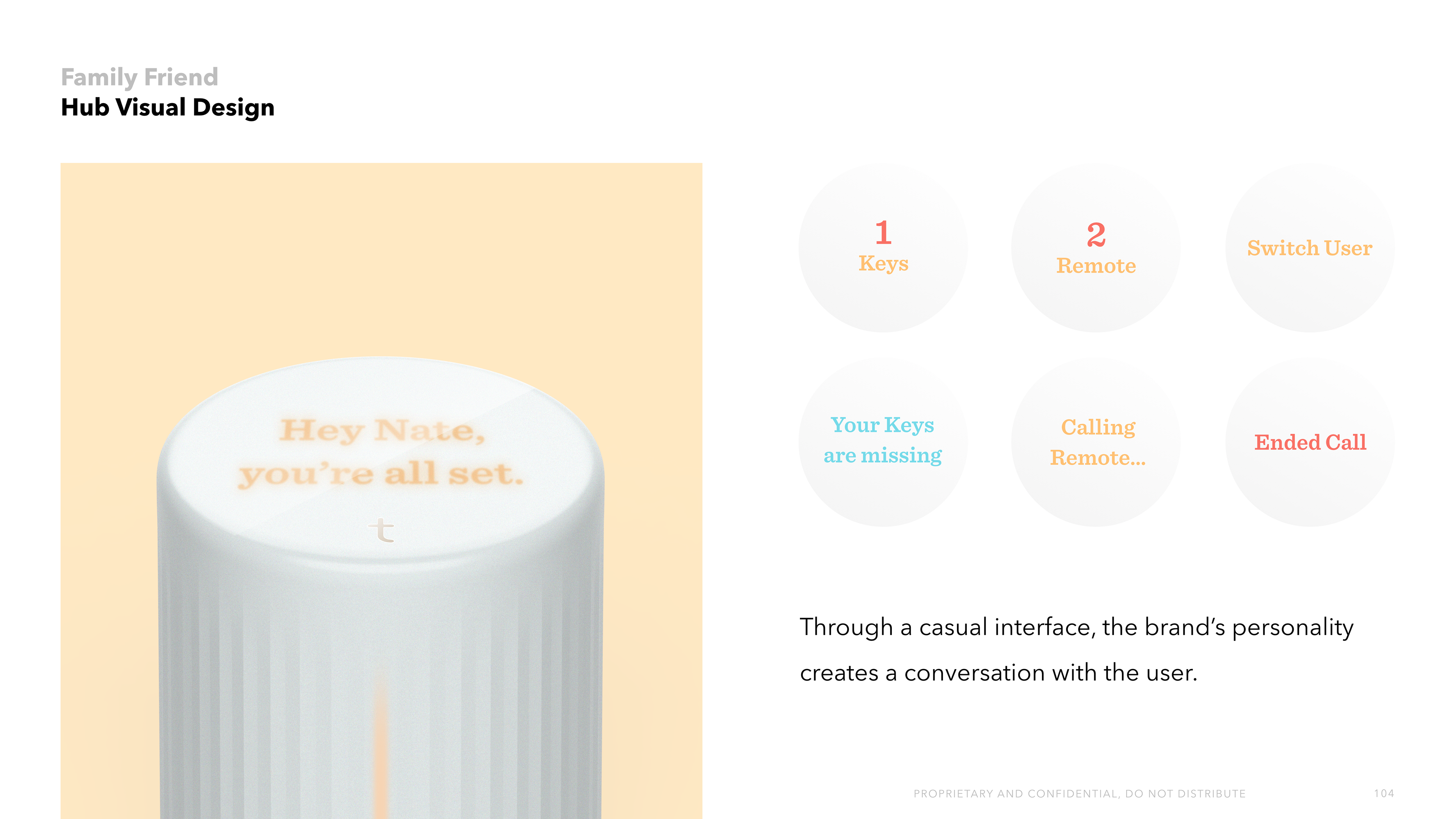
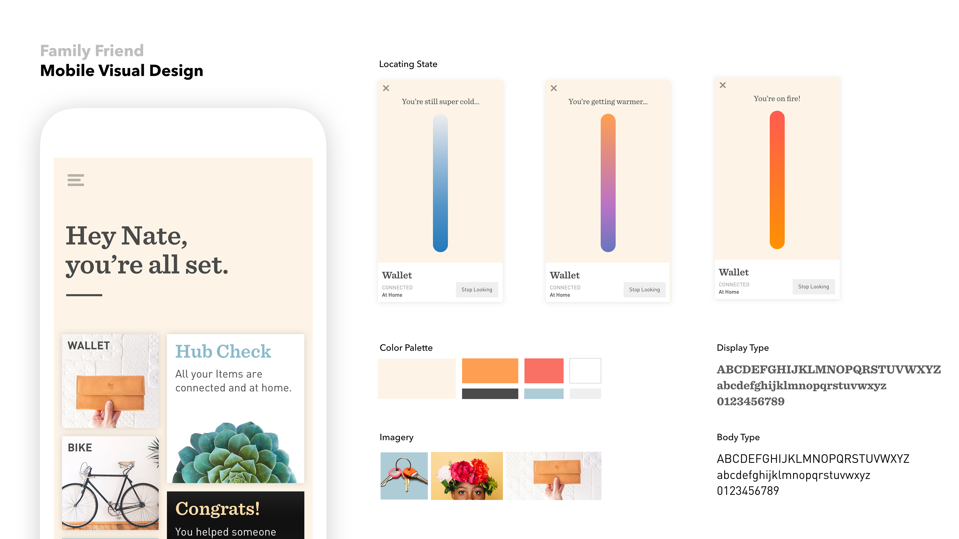
Family Friend
Documentation
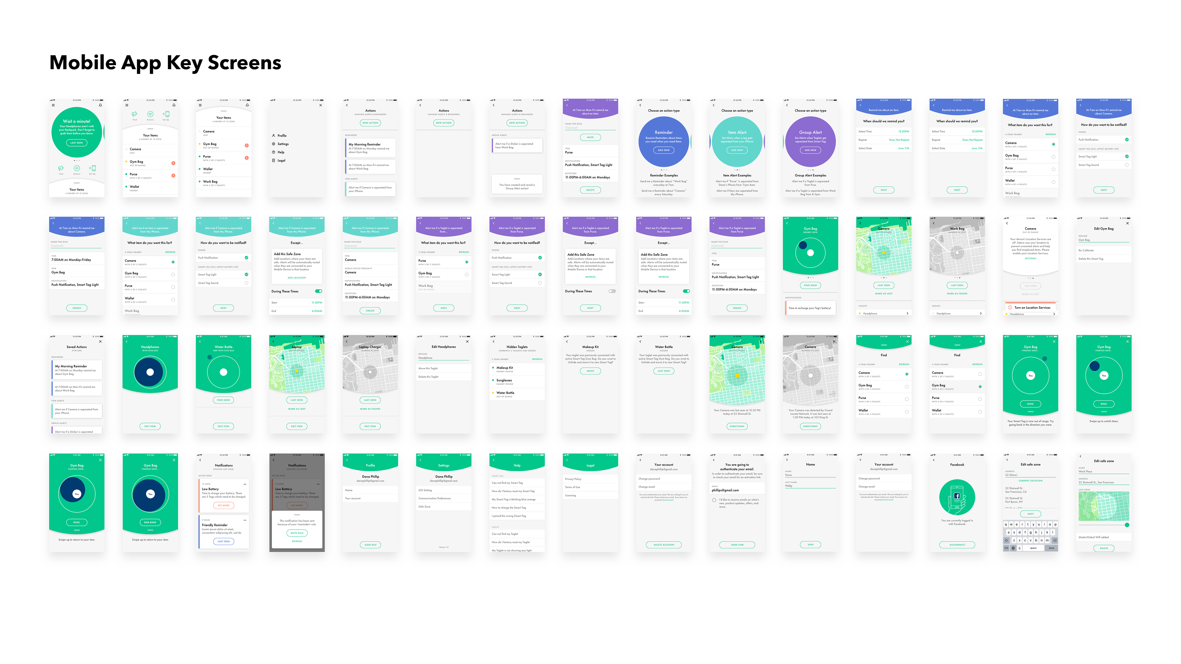
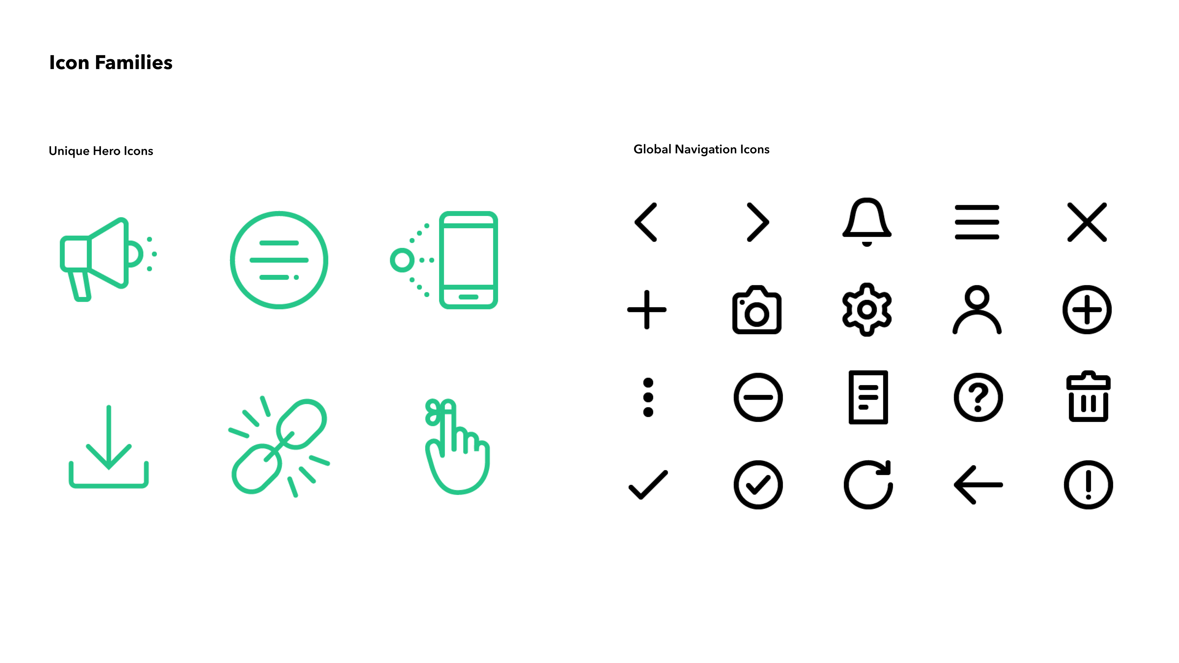
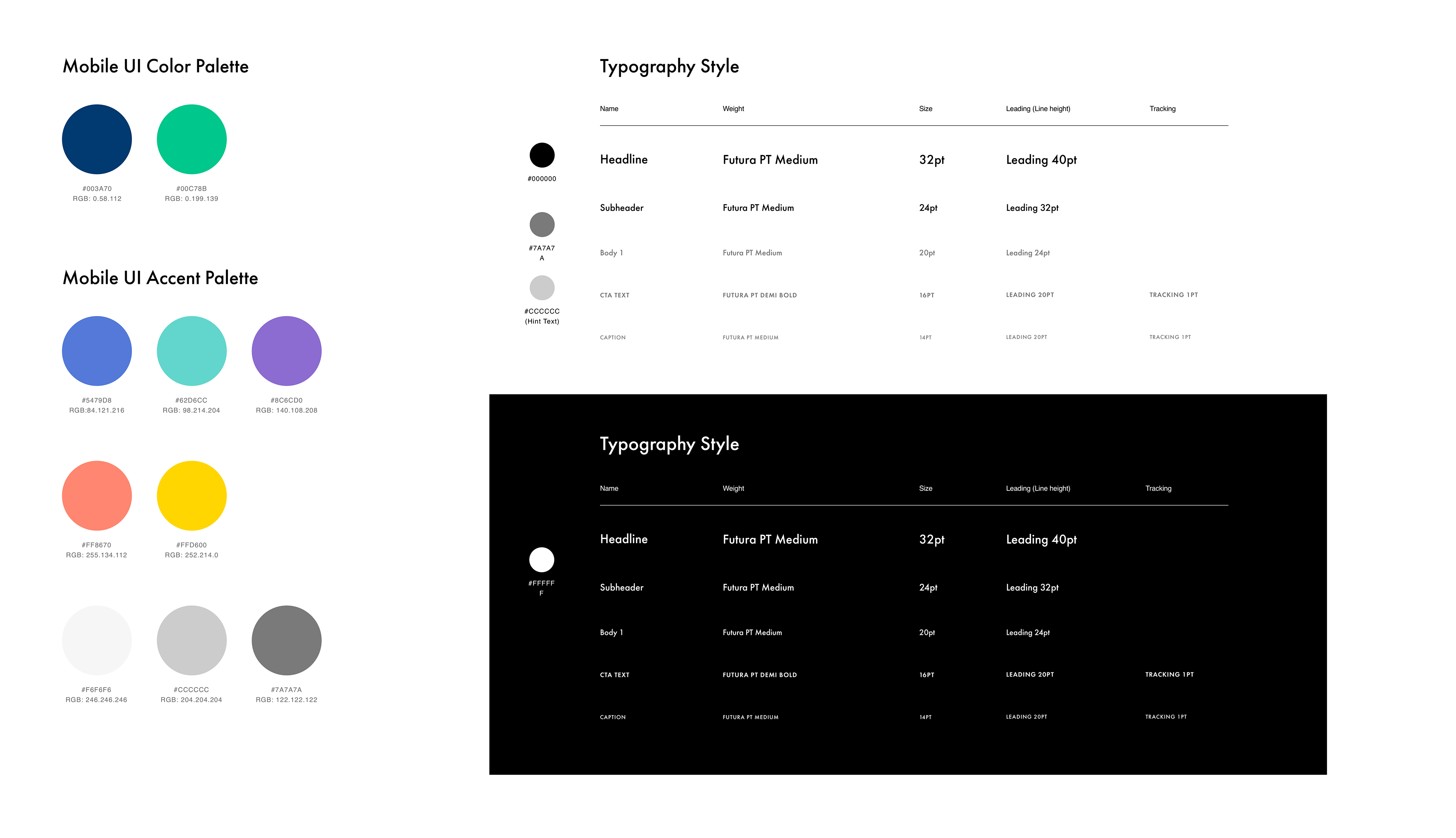
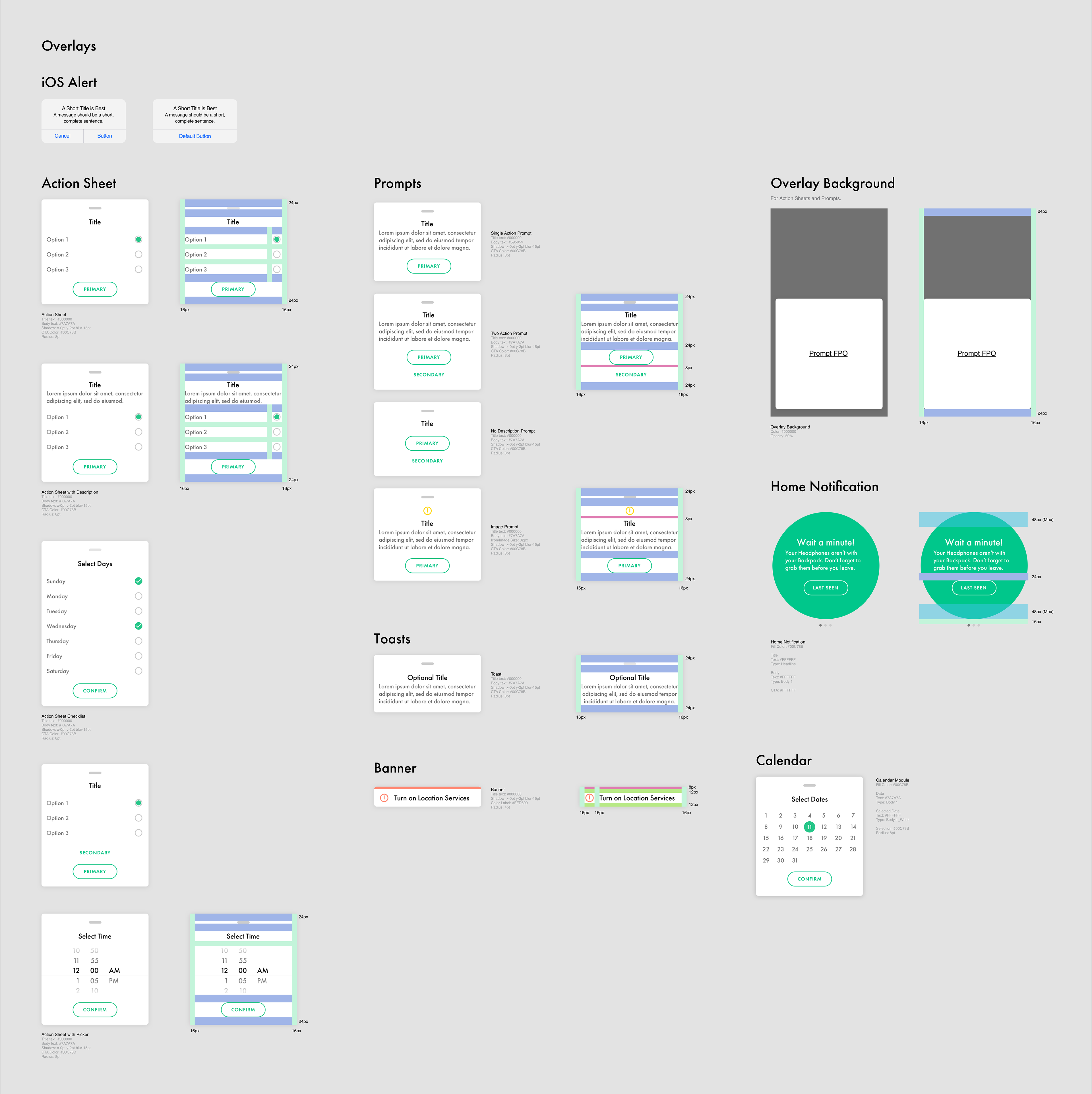
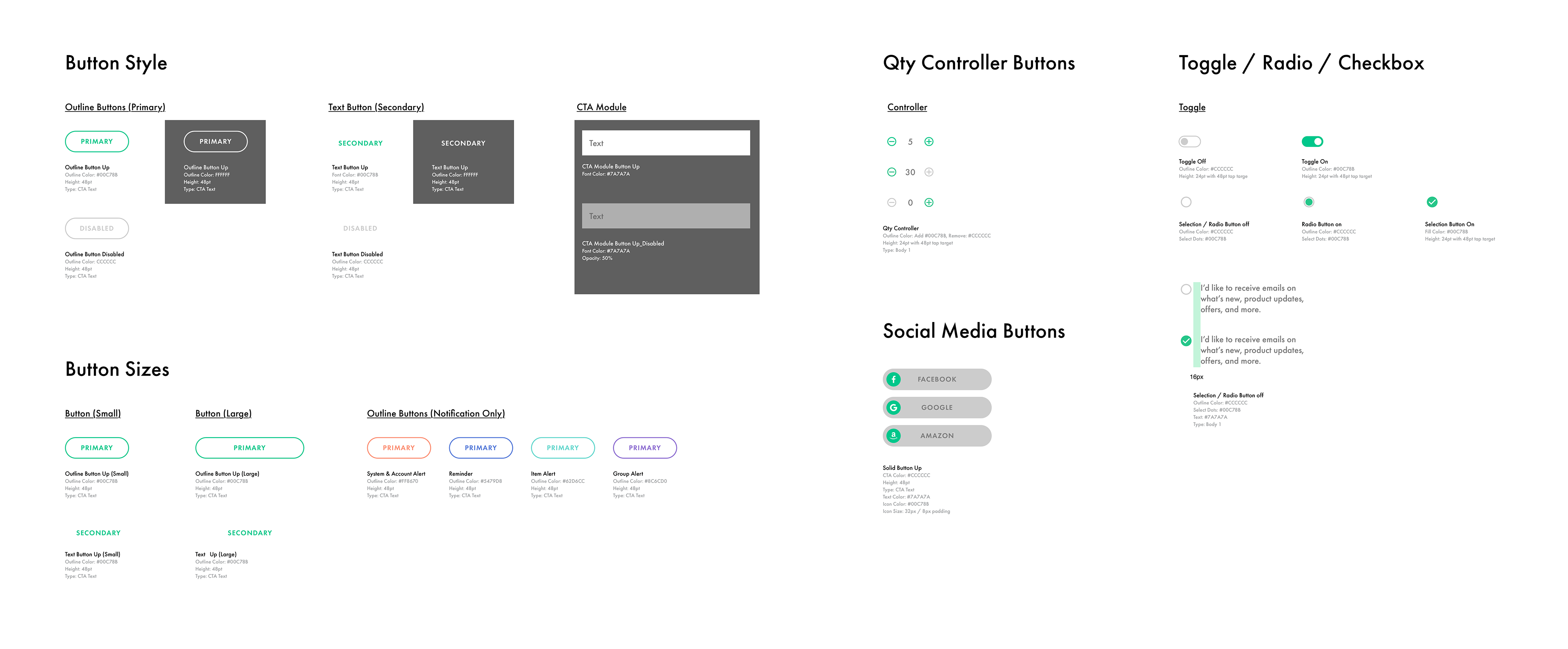
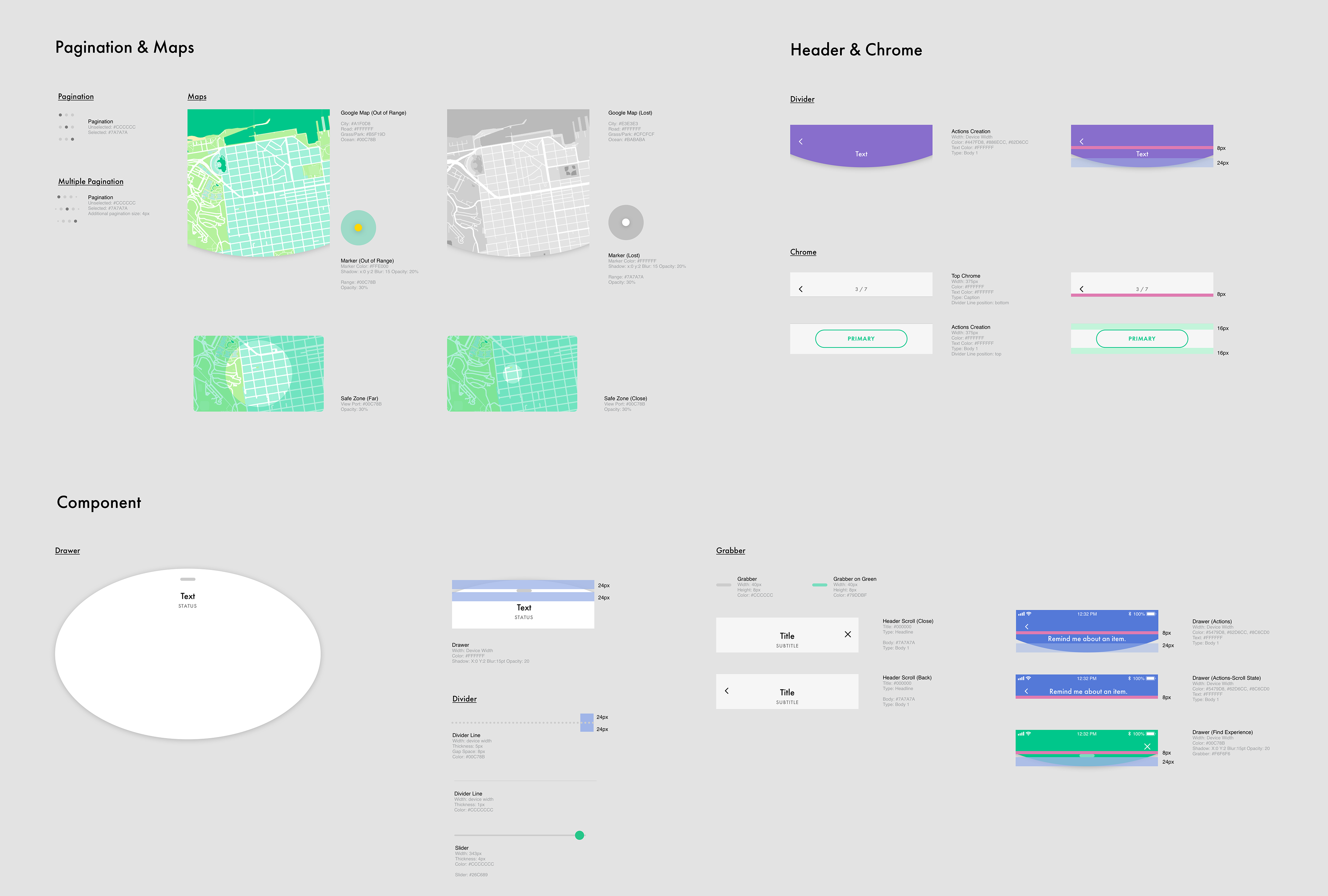
The final deliverables for the mobile app included comprehensive documentation of the Visual Design Language System, covering design specifications and guidelines, as well as motion and interaction design for both Android and iOS. We provided the necessary assets to our development partner through Zeplin. Additionally, we created a fully detailed, cloud-based design website for Adero using Confluence, a collaborative software platform. This site houses all working files, templates, motion specifications, information architecture (IA), journey maps, and interaction documentation, providing valuable resources for future iterations of the app.

Final Results
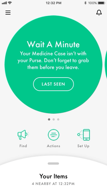
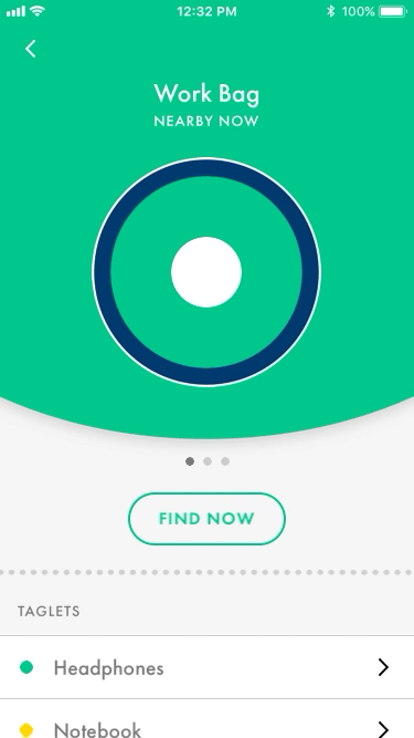
The new Adero app is centered around organization. By creating an app that is dynamic from the onboarding to the core screen experiences of managing and finding your items, we’ve created an experience that is unique to each individual by allowing users to streamline their daily routines, thus increasing user engagement. We wanted to make interacting with the mobile app and product feel fresh and personalized. Through fluid transitions, simple visualizations, sound and visual hardware queues, we created a rich and unique experience.